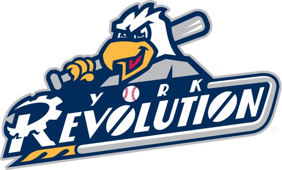
The York Revolution (independent; Atlantic League) unveiled new logos and uniforms today, overhauling the team’s image after five years in business.
“Our previous logo did not reflect the essence of York as a special and unique manufacturing town,” said Revolution President & General Manager Eric Menzer. This new one embraces that. “We’ve also taken our eagle, which is still the focal point of our identity, and brought him to life. Finally, the new logo conveys a brighter and more personal look, the new logo better conveys what minor league baseball is all about.”

The previous “flying eagle” primary logo has been retired by the organization. That mark was used sparingly during the 2011 season, as plans for the identity shift were developed. Brandiose, which has worked with dozens of professional teams and college athletic departments on branding helped the Revolution during the creative process. The “Y eagle” mark and the profile eagle head will still be available to fans on a limited selection of merchandise, as they were the original “on-field” logos of the team.

Menzer and his staff considered many factors during this process:
- The best reflection of York: While the “Revolution” moniker may have had colonial connotations at the franchise’s outset, York’s contributions to the Industrial Revolution were far more dramatic than its colonial heritage. While York County did play a role in the American Revolution, its manufacturing might was a significant factor during World War II, and continues today with local staples such as Harley Davidson, York International/Johnson Controls, Stauffer’s and many others. The new marks clear up any doubt that York was a key figure in the industrial Revolution, and maintains a proud manufacturing heritage. Adding the gear, screws and exhaust pipe to the eagle in the logo tell a much more accurate story of what York and York County is, compared to the “flying eagle” logo, as York continues to have one of the highest percentages of its work force in manufacturing in the nation.
- Remaining patriotic: The bald eagle was, is and will be an important part of the Revolution’s identity. At no point did the organization consider straying from that. “We achieved our goal of staying with that American spirit and keeping the eagle a part of us, while accomplishing our other goals with this logo,” Menzer said.
- Continuing to strive for a family friendly environment: If you look at the new eagle, he is both fierce and jovial, a delicate balance. The trend for modern minor league baseball identities is an animated one – literally. Most teams when they brand, or re-brand have an animated character element to their logo. This invites fun and makes the point that a night at the ballpark is great fun. Yet the logo is still intimidating, making the point that the teams on the field are there to win for their teammates, and their fans. The Revolution is embracing this trend. Simply put, the eagle has been “brought to life,” and is no longer a “flat” logo.
- Distinguishing the York Revolution from its on-field rivals: Very few minor league baseball teams share the Revolution’s new color emphasis of Navy blue and gold, and no Atlantic League teams share such colors. Red has been dropped from the team’s primary color scheme, and the gold has been “softened” from the more bronzed-type color the team had used in the past.
- Embracing the creative progress of York: The new marks are in-line with the “Creativity Unleashed” community branding initiative being supported by the York County Economic Alliance and other York City and County leadership organizations. The Revolution aim to embrace the same core community identity that York’s community leaders are promoting.
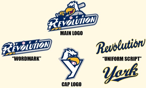
- In addition to the logo above, the team has also introduced two secondary marks, the “wordmark” logo, which is the main logo minus the eagle, and the “Y” logo, containing the eagle head, very similar to the previous Y logo which appeared on the Revolution’s cap. The new Y logo will continue to appear on the Revolution’s cap.
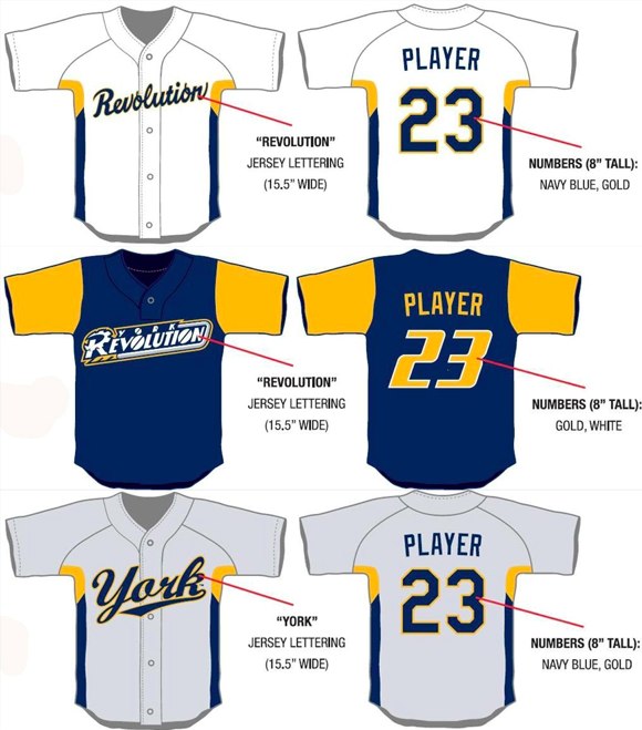
The team has also unveiled new uniforms with the updated color scheme. The classic Revolution cursive script will continue to adorn the front of the primary home white jerseys in Navy blue, with a gold outline and Navy and gold trim. Script “York” will also continue on the road grey jerseys as it has in past seasons with the updated colors. The team will wear a navy blue alternate jersey with gold sleeves at home and on the road, which will feature the “wordmark” logo across the front.
—-
Share your news with the baseball community. Send it to us at editors@augustpublications.com.
Are you a subscriber to the weekly Ballpark Digest newsletter? You can sign up for a free subscription at the Newsletter Signup Page.
Join Ballpark Digest on Facebook and on Twitter!
Follow Ballpark Digest on Google + and add us to your circles!
