 The American Association unveiled new branding for 2021 in a partnership with Baseballism, as the MLB Partner League upgrades its look for the first time since the modern version of the circuit began play.
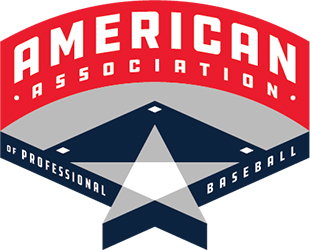
The new primary logo is designed off a baseball field layout, with a star that incorporates home plate. The logo keeps league’s traditional red, white and blue color scheme and drops the word “independent” from the full official name of the league.
“A new look and feel for the American Association was long overdue, and to be able to work with a company like Baseballism to make it happen is very exciting as we move into a new era as a Major League Baseball Partner League. This logo brand signals a new vision for the league and will appeal to a younger demographic.” said American Association Commissioner Joshua Schaub. “The logos are clean, modern, and a fitting visual representation of the professionalism of our league, our players, and our organizations. It’s a look we think our fans will embrace and look forward to seeing it on the field and in our stadiums in 2021.”

In the redesign, the American Association and Baseballism created primary, secondary, tertiary and wordmark logos, as shown above. All logos will be featured in branding from the league moving forward and are part of a larger branding and communications plan to include, among other items a new website and upgrades to the league’s American Association TV streaming property.