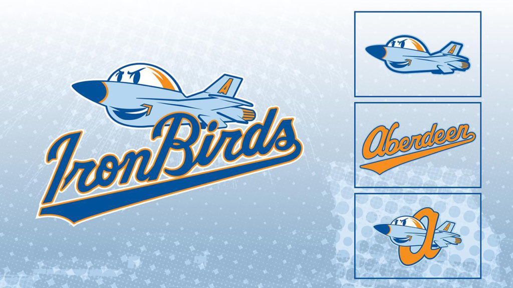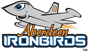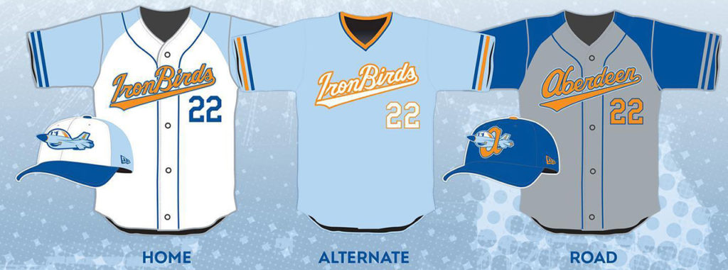
We have a new look for Ace the Jet more in line with his original 2002 look, as the Aberdeen IronBirds mark their 20th season with a logo and branding makeover.
 The new look doesn’t fall in line at all with the familiar black-and-orange hues of parent Baltimore Orioles, but it does fall in line with the original branding for the team, which launched play on June 18, 2002, then as part of the Short Season NY-Penn League. (Indeed, the homage to the Orioles can be seen in the team name–the Birds representing both the Orioles–while Iron represents team owner Cal Ripken Jr. Alas, the new logo drops the #8–Ripken’s jersey number–found in the original Ace logo.)
“We are beyond excited to finally reveal our new logos, colors, jerseys,” said General Manager Jack Graham via press statement. “The 20th season of IronBirds baseball will be the biggest one yet and fans deserve this new look to go along with such a milestone.”
The new logo was created in-house by Kevin Jimenez, Director, Creative Services for the IronBirds.

