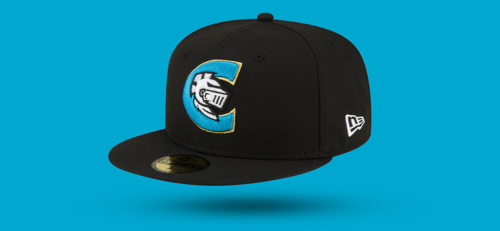
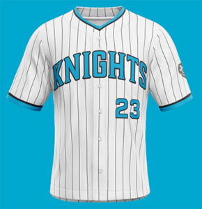
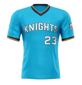
We have another new look on tap for the 2023 season, as the Charlotte Knights (Triple-A; International League) unveiled a brand refresh with new logos and jerseys.
 It’s obviously time for a refresh: the Knights are celebrating the team’s 10th year in Uptown Charlotte. “As we prepare to enter our tenth year back in the city of Charlotte, we thought it was the right time to make an even stronger connection,” said Knights’ General Manager Rob Egan via press statement. “It began with opening this beautiful ballpark in Uptown in 2014, continued with changing our official abbreviation to CLT in 2021, and is furthered by modernizing our brand and aligning with the palette of professional sports teams in Charlotte. Our new primary color, Knights Blue, is the right fit at the right time. It’s All Charlotte!”
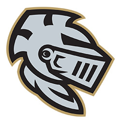 Highlighting the team’s brand refresh are a new primary logo, new home/road cap logo (shown to the left) and an alternate helmet cap logo (shown to the right). In all, the Knights unveiled three new jerseys (home, road and alternate), three new on-field caps and a new identity fit for the Queen City. The team’s brand refresh showcases blue, a color synonymous with three other professional teams in Charlotte – the Carolina Panthers, Charlotte FC and the Charlotte Hornets. Knights Blue is the signature piece of the brand refresh. The logo also continues to feature Knights Gold, Knights Silver and Knights Black, colors synonymous with royalty.
 The brand refresh was brought to life by David Ruckman of David C. Ruckman Creative. The development process began in November of 2021 when Ruckman started the early design phases with members of the Knights front office. “Words cannot express my gratitude at this point. “Even after my nine years working with the Charlotte Knights, we still find new ways to work, have fun and be creative together. It doesn’t get any better than that,” Ruckman said via press release.
Merchandise featuring all of the team’s new logos and colors are available now in the Charlotte Knights online store.
