We’ll see plenty of change in downtown Minneapolis in 2023: Besides the already-announced changes to Target Field for the MLB season, the Minnesota Twins are embarked on an offseason rebranding exercise.
The 2023 changes are relatively modest in the grand scheme of things, but certainly impactful to the game experience: an expansion of the outfield videoboard, a two-year project that began this year with an upgrade to the Target Field control room. The new videoboard is 76 percent larger than the current board. Also part of the 2022-2023 upgrade: new turf, The videoboard upgrade will cost $33 million–$7.6 million for replacing the control room, the rest for the actual videoboard from Daktronics.
And, given that the Twins usually implement some other sort of ballpark upgrade annually, we’ll probably see more Target Field upgrades in 2023.
Those aren’t the only change for Twins fans in 2023, as Dave St. Peter shared the news that the Twins are embarking on a rebranding for the season. He didn’t really share too many details, just promising the team would have a new look for the campaign, per the Star Tribune:
“Our uniforms are going to evolve and take a step toward the future. There is always a sensitivity to paying respect to the history and the heritage of the franchise,” team president Dave St. Peter said. “But there’s also a desire to move it forward, much like we did in the mid-’80s.”…
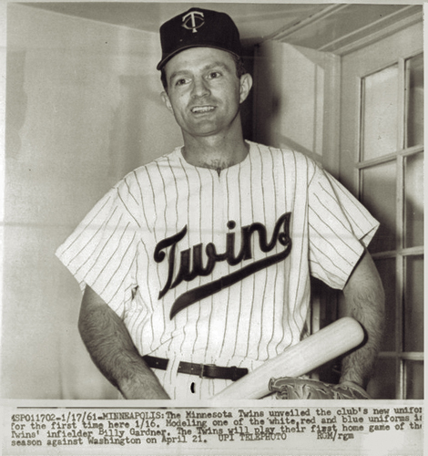
The uniforms, which are complete but won’t be revealed until after the season ends, are just the most obvious aspect of a general rebranding of the 62-year-old franchise, St. Peter said, one that will include “tweaks or in some cases, more than that” to the team’s brand identification: the lettering, the logos, the look of the team. The colors won’t change — “This franchise has embraced the base colors of red, white and blue since 1901,” when it was the Washington Senators, St. Peter pointed out — but he believes a new look is well-timed.
“We’re in a little bit of a different world today, and we’ve seen several brands go through a refresh. The Padres are a great example — they went with a refresh that actually reached back to their origins, but they did it in a really bold, dynamic way,” St. Peter said of San Diego’s re-embrace of its brown-and-gold, swinging-friar history. “It wasn’t just a cookie-cutter of what Steve Garvey wore in 1984. And our goals are the same. How do you pay tribute to that history and heritage, but do it in a very modern way?”
The team did overhaul its main logo in 1987 along with cap and jersey designs, but since then have introduced tweaks on both old and new designs; for instance, the beloved blue uniforms returned in 2020, a Kasota Gold trim was added to caps, and the team brought cream-colored uniforms during the move to Target Field as well. But the elements, by and large, have stayed the same.
RELATED STORIES: Massive augmented reality planned for Target Field; Twins unveil newest Target Field public art; Target Field updates due in 2022, 2023; Target Field at 10; Twins Unveil 2019 Target Field Upgrades