Another team with an updated look, as the Hickory Crawdads (Low A; Sally League) unveiled new logos, lettering, numbers, jerseys, and hats for the 2016 season.
The new look comes from Louisville-based Studio Simon.
“We wanted to update the look of the Crawdads without abandoning our classic logos,” said Crawdads General Manager Mark Seaman. “Studio Simon did a great job of maintaining the spirit of our original logos while also updating them for the first time in 23 years. Between the logos, the jerseys, and the hats there’s a lot for fans to take in, but it all feels like it fits. It all feels like the Crawdads.”
“As much as we enjoy working together with teams to develop new brand identities from scratch, we equally relish any opportunity we get to refresh existing identities and then build them into fully fleshed-out systems that give clubs more tools at their disposal than they ever had before,” said Studio Simon owner Dan Simon. “So of course we were thrilled to be tapped by the Hickory Crawdads to collaborate with them and give their identity the love that one of Minor League Baseball’s iconic brands truly deserved.”
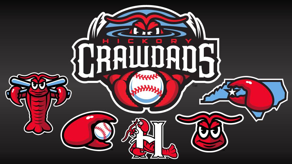
The focal point of the redesign was the Crawdads brand new primary logo, which showcases an updated take on the traditional Crawdad while also introducing the new team font and “Crawdads Blue” color. The logo shows a pair of intimidating, red Crawdad eyes and a set of claws emerging from the blue water along with the team name inscribed in the new font.
The new primary logo is joined by three brand new secondary marks as well as two updated team logos. The new secondary images include a claw holding a star indicating Hickory’s location over a blue outline of North Carolina, a full-body Crawdad holding a pair of crisscrossed, blue bats, and finally a close-up of the revised Crawdad head. The Crawdads traditional “H” logo returns, but with an updated Crawdad emerging from behind a revised “H.” The team’s claw logo is also back, albeit with a slightly redesigned shape along with updated shading and coloring.
“We felt like it was a good time to introduce a new color to go along with our established red and black combo,” said Crawdads Executive Director of Corporate Sales & Merchandise Douglas Locascio. “It gives us an opportunity to freshen up our look while also staying true to our history. Red is definitely still our primary color, but fans will notice blue cropping up in small and big ways.”
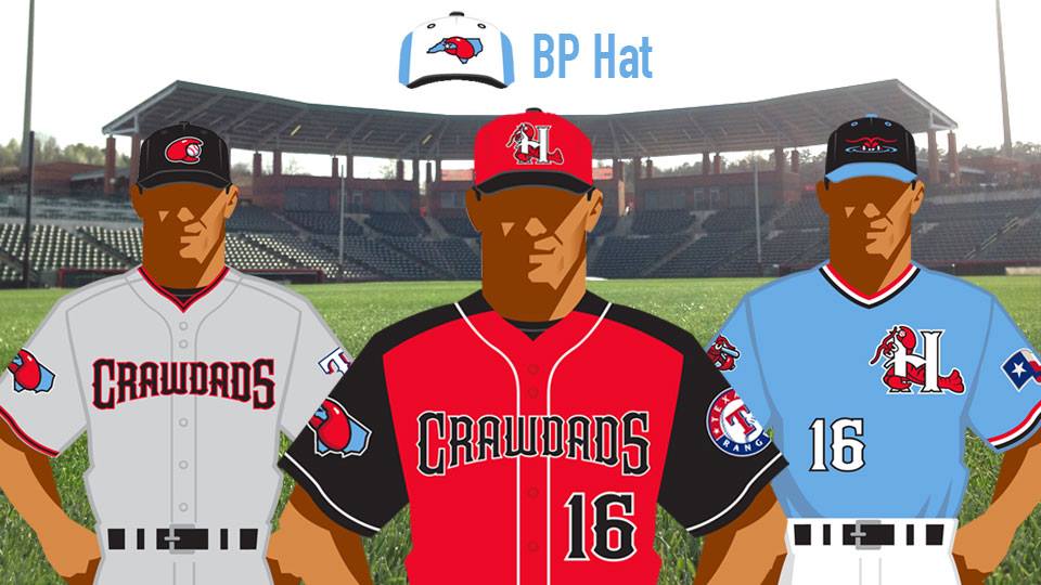
All of the Crawdads new logos and colors will be utilized in new uniforms and hats in the 2016 season. The ‘Dads home uniforms will once again be predominately red as in years past, but will also feature black sleeves and white piping. The jerseys will display “Crawdads” across the front in the new team font, while also using the new-look numbers on the back. The road jerseys remain all grey with “Crawdads” on the front. The ‘Dads are also introducing a new “Crawdads Blue” alternate jersey that can be worn both at home and on the road. The V-neck uniform will have the revamped “H” logo on the left chest, while also displaying white numbers on the lower right side of the front in addition to the back.
The three jerseys will be joined by three new on-field hats as well as a new, tri-color batting practice hat. The home hat will feature a red crown with a black bill and will maintain the tradition of displaying the “H” logo. The road cap will be all black with the revised Claw logo on the front, while the new alternate cap will have a black crown with a blue bill and eyelets showcasing the Crawdad eyes emerging from the water on the front. Finally, the team’s tri-color BP hat will have a white front, blue back, and black bill along with the state logo.


