New Minnesota Twins branding was unveiled by the team today at the Mall of America, with a new look linking the past to the present and a notable return to the team’s original, never implemented name of the Twin Cities Twins.
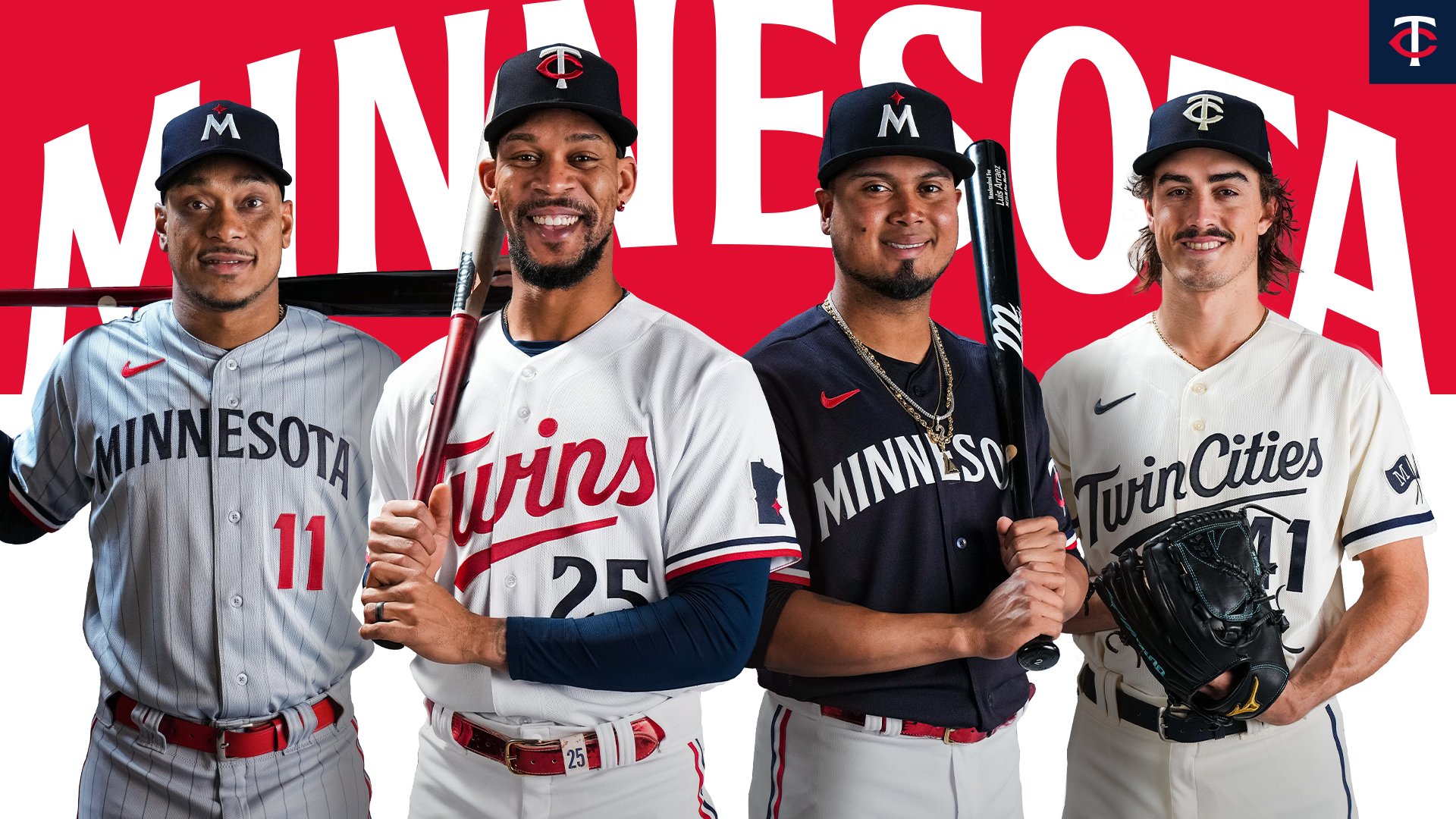
![]() Unveiling at the Mall of America was certainly a physical reminder of the team’s roots: it sits on the site of Met Stadium, the team’s home when it moves from Washington, D.C. in 1961. The new uniforms served as another physical reminder of that move: the original “TC” cap logo was streamlined for the modern era, and a white version will be combined with an alt Twin Cities Twins uniform. (The origin of Twin Cities Twins: that name originally chosen by Calvin Griffith when he moved the team to Minnesota and Bloomington’s Met Stadium. The team’s original “TC” logo was designed assuming that brand. However, Griffith was talked out of that team name by local business leaders, who argued he should take a more regional approach to the team name. Hence the “TC”; hence the team name. It was groundbreaking–no other sports team had been named to represent an entire state as opposed to a city, and the thinking here is that the Twin Cities Twins will be the first to represent an entire metro area.)
Unveiling at the Mall of America was certainly a physical reminder of the team’s roots: it sits on the site of Met Stadium, the team’s home when it moves from Washington, D.C. in 1961. The new uniforms served as another physical reminder of that move: the original “TC” cap logo was streamlined for the modern era, and a white version will be combined with an alt Twin Cities Twins uniform. (The origin of Twin Cities Twins: that name originally chosen by Calvin Griffith when he moved the team to Minnesota and Bloomington’s Met Stadium. The team’s original “TC” logo was designed assuming that brand. However, Griffith was talked out of that team name by local business leaders, who argued he should take a more regional approach to the team name. Hence the “TC”; hence the team name. It was groundbreaking–no other sports team had been named to represent an entire state as opposed to a city, and the thinking here is that the Twin Cities Twins will be the first to represent an entire metro area.)
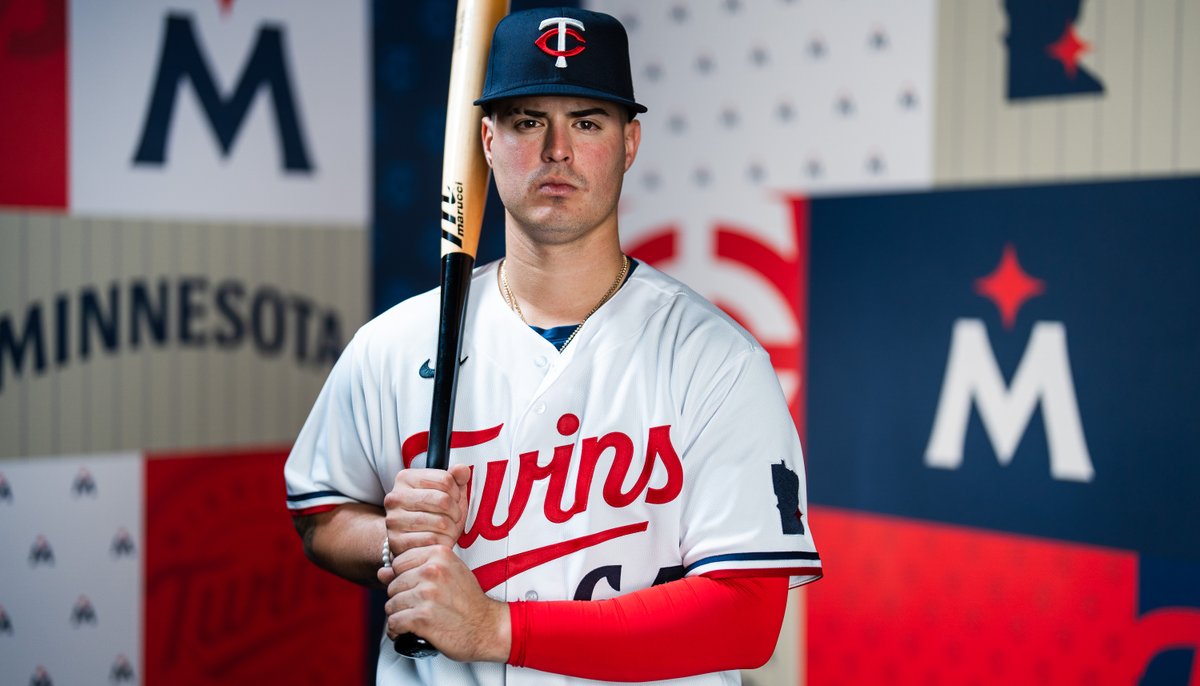
The other elements of the four new uniforms both link to older uniforms and modern touches. The new home jersey script is reminiscent of the original Twins script and the 1987 uniform makeover. A new M cap logo is topped by a red star, a nod to the state’s official motto, L’etoile du Nord (“star of the north”). Pinstripes are back in the road grays, and a blue uniform will be worn as an alt both at home and on the road.
Photos courtesy Minnesota Twins.