New Nashville Sounds logos, marks and branding were unveiled tonight, as the team instituted a classic look while borrowing elements from the Tennessee state flag and other local musical influences.
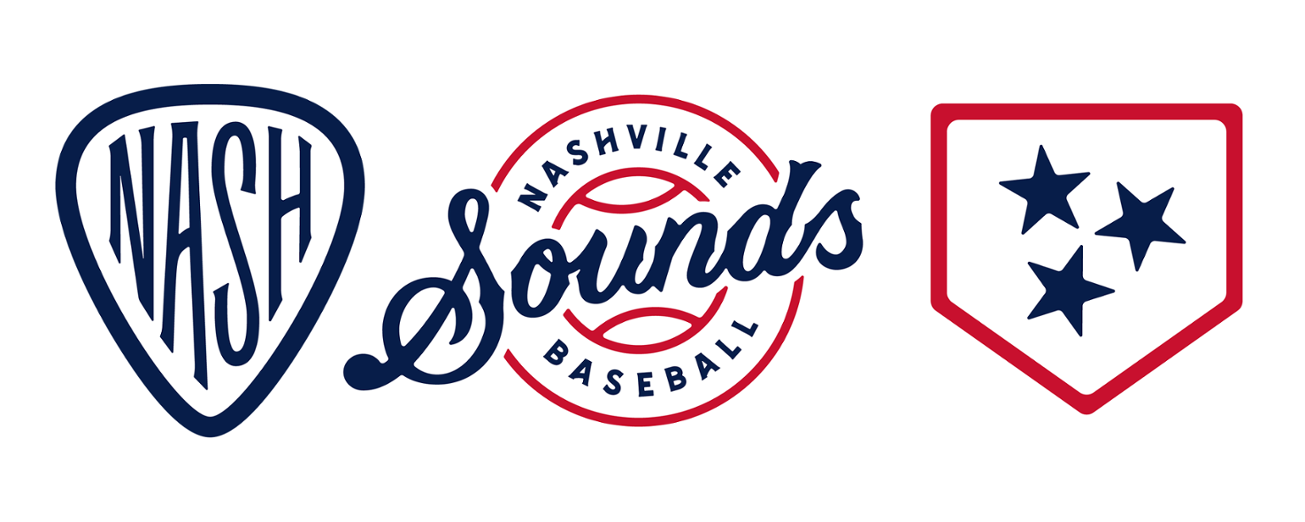
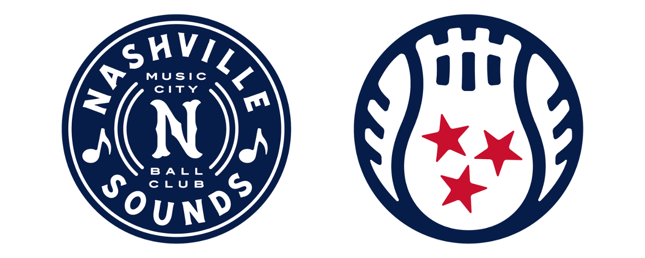
The new primary logo from the Class AAA Pacific Coast League team features double red circles complete with navy blue “Nashville” and “Sounds” composed in the new “NASH” font in the outer circle. The inner red circle shaped as a baseball features a bold navy blue “N” with subtle characteristics derived from the F-hole of a guitar or violin. The logo also features twin stripes pulled from the Tennessee state flag adopted in 1905. The red and navy blue stripes are set opposite each other between the circles.
“This is a historic and exciting day in Nashville Sounds history,” said Sounds General Manager Adam Nuse. “This new era of Sounds baseball captures Nashville and the surrounding communities in its entirety, while paying homage to the team’s rich history. We’re thrilled to bring about a look focusing not only on Broadway, but all the communities that make Music City. We’re confident this rebrand is something all of Nashville can be proud of.”
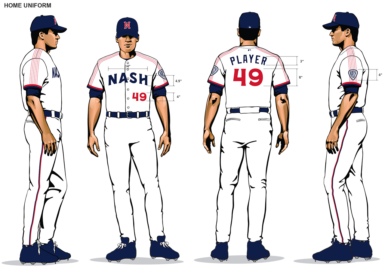
Nashville’s new home uniform features a white jersey with navy blue “NASH” emblazoned across the chest. The “A” and “H” feature distinct custom crossbars angling up from left to right to pay respect to the unique shape of the right field hill at Sulphur Dell, the original home to professional baseball in Nashville. Additionally, the sleeves feature a stylized “NASH” pick in front of six guitar strings.
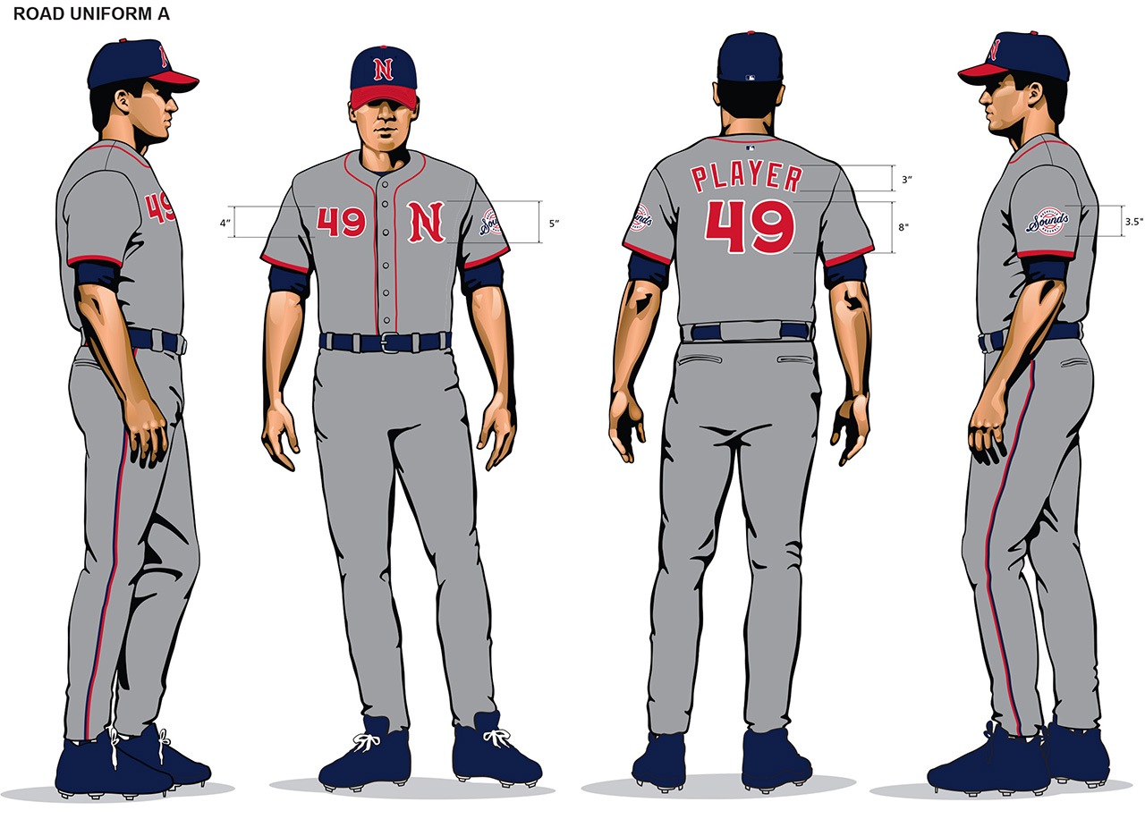
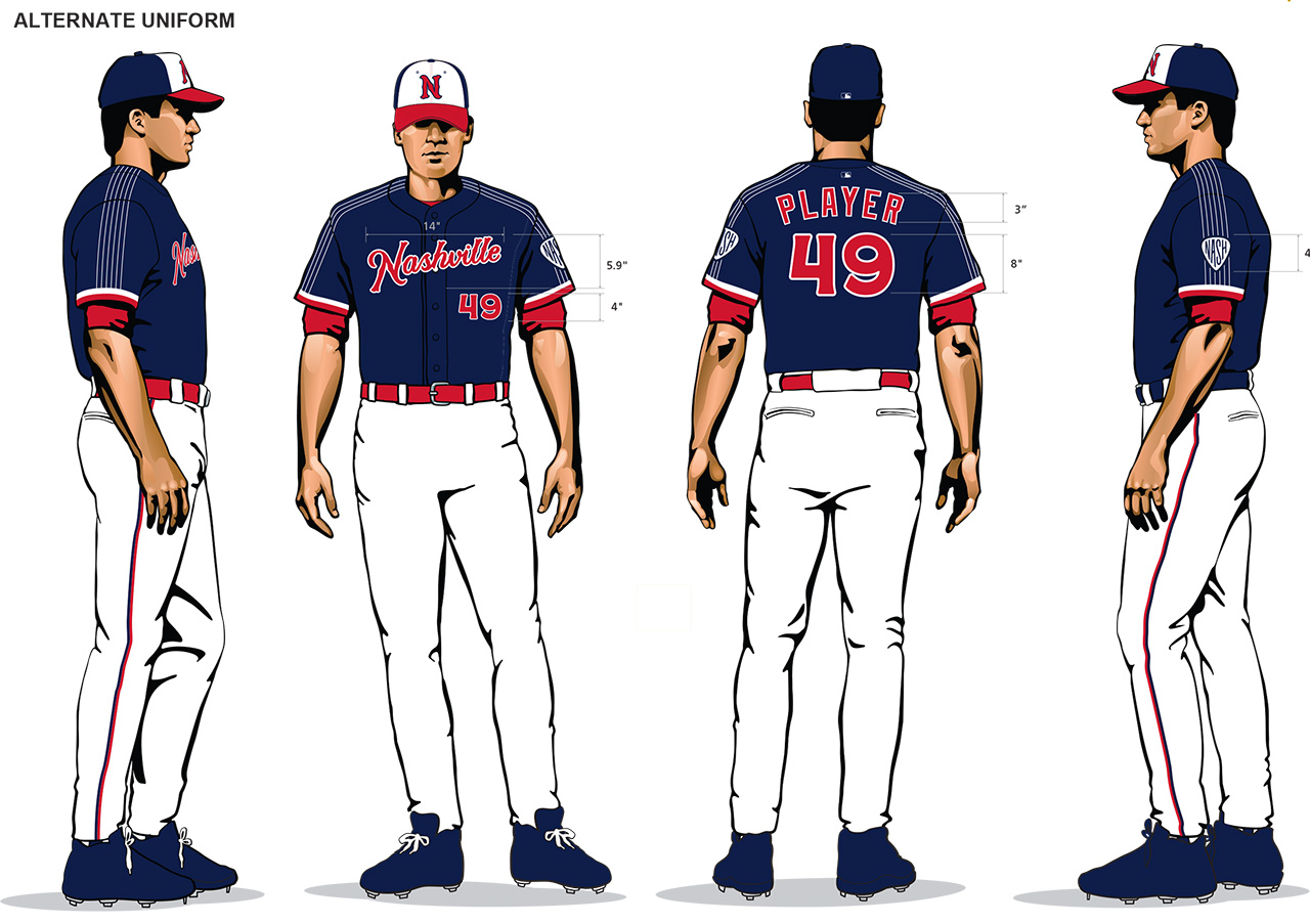
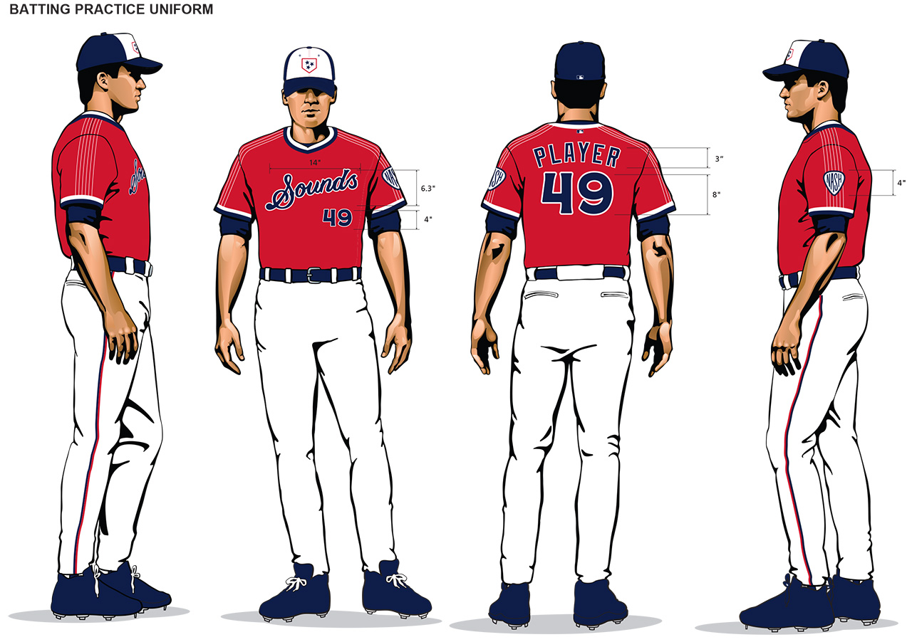
Three other uniform combinations were introduced in addition to the traditional home white. The navy blue alternate jersey establishes the team’s newest color which pulls from the state flag as well as the original uniform colors from 1978 with a modern spin. The alternate red jersey top is the only one of the four to feature “Sounds” prominently across the chest. The road gray jerseys feature the player number and “N” icon paired together in red across the chest.
Home white, road gray and the alternate blue jerseys are paired with the “N” icon hat featuring different color schemes for each hat. The red alternate jersey is paired with the unique Tri-Star Plate hat. The Tri-Star Plate hat is navy blue with a white front featuring a home plate outlined in red with the navy blue Tri-Star in the middle.
The team’s new identity comes from RARE Design, a Hattiesburg, Miss. branding company. RARE Design has done rebrands for the NBA’s Atlanta Hawks, Charlotte Hornets, Minnesota Timberwolves and Sacramento Kings.
