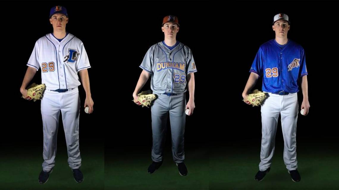
The Durham Bulls (Class AAA; International League) unveiled new uniforms for the 2018 season, incorporating the iconic “D” logo for home uniforms while updating the colors and look.
Yes, the “D” bull logo is back, as the team returns to the popular uniform look. (How did that logo come to be? It was created for the Bull Durham movie, with writer/director Ron Shelton asking movie-studio designers to come up with a logo he could incorporate in the film, according to former team owner Miles Wolff. You can read about that logo creation in Mark Cryan’s Cradle of the Game.) The new home unis will look like the classic uniforms once worn by the Bulls, except for one change: the numbers on the back will be burnt orange ringed by blue.
The redesigned away uniforms will now sport “DURHAM” in block letters, replacing “BULLS.”
The alternate uniforms are themed as Bull City, with the snorting bull standing on its own. “The Bull City design is one of my favorites,” said designer Brian Begley. “Using just the bull from the primary logo, I created the lettering for, ‘CITY’ to fill the guts of this element. This design represents the winning Durham community with history and class.”
You can see more of the new Bulls uniforms here.
Images courtesy Durham Bulls.

