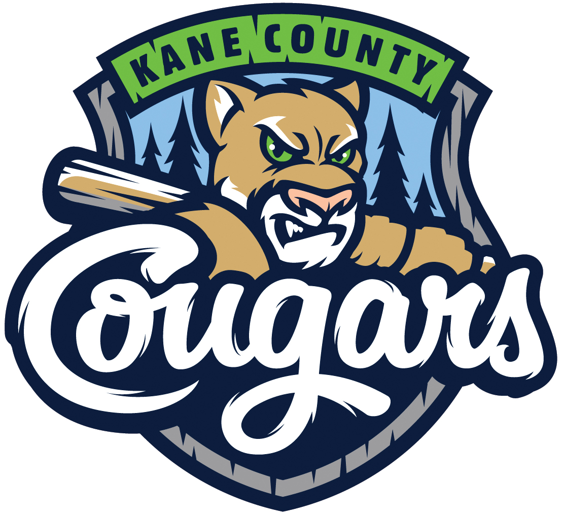
The Midwest League’s Kane County Cougars remade their look for their 26th season. The new logo features evening-shadowed evergreen trees of the western Chicago suburb behind a menacing anthropomorphic cougar, and the team nickname written in in a furry white cursive in the foreground, all of it framed by a park ranger’s badge.
It is outdoorsy, polished and distinctive in the modern Minor League theme: central character front and center, individualized font, bold, stylish, subtle.
 The team’s old logo, introduced at the team’s inception in 1991, was the opposite of this. If you saw it, you knew that it looked more like a Cub Scout badge than any other Minor League Baseball logo in the country. What was it? A minimally drawn cougar face centered on a white baseball, the team name written in block letters inside a medium-sized green border circling the ball.
Entering 2007, the franchise decided a bit of spicing up was in order, unveiling a snarling cougar head with bright green eyes for use on baseball caps, and a green-seamed baseball clutched between two paws as an alternate logo.
But that 1991 image — the ball, the green border, and the cougar face so plainly drawn — was never phased out. It was beloved, the oldest remaining logo in the league, a throwback to a different generation of Midwest League baseball. Up through 2015, it was a living snapshot of early ‘90s Single-A baseball, back before Minor League ballparks featured high-definition video boards, banquet facilities, and hamburgers large enough to feed an extended family.
 This is the joy of Minor League logos, giving us a glimpse into the artistic sensibility of the generations. In the mid-1990s, not all that long ago, when Sea Dogs and RiverDogs were all the rage, the Auburn Doubledays were introduced: a double-D logo, an arching nickname, and a vintage mustachioed baseballs, firmly grasped in his bare hands (and a pitched ball zooming straight for his nose; it was 19th century baseball, it was rougher back then). They still retain the same logo today, the oldest look in the New York-Penn League. The oldest look in the California League belongs to the High Desert Mavericks, who trace their stetson-hatted image back to 1991, contemporaries with Kane County. Two years ago, the International League’s Buffalo Bisons went back to their look first shown off in 1985, a cartoonish bison batting from the right side, front leg raised in anticipation. Their rivals, the Toledo Mud Hens, have featured the same zoned-in avian slugger for decades. And the Southern League’s Chattanooga Lookouts’ classic dual peering eyes, housed within a block C, goes back as far as most anyone can remember. Operated for so many years by showman Joe Engel, it stood to reason that the Lookouts would have an eye-catching look — and even more to reason that they would maintain it, with a tweak here and a color change there, in the years since.
For those teams who aren’t the Mud Hens or the Lookouts, a logo/image makeover for a Minor League team offers a rebirth, providing a new feel on the field, and a new energy in the retail store. Coupled with a name change, it seizes the stage and take a bigger grip of its region.
 In recent years, it was easy to take the South Bend Silver Hawks or the Akron Aeros for granted, considering them just one of many, without a reason to stand out. A switch to the South Bend Cubs, changing a look that had been around since 1994, and Akron RubberDucks, since 1997? Attention given.
The logo change also provides the opportunity for complexity. There is more symbolism in the new Cougars’ logo than the old: the new-look cougar has green eyes, connecting it with its 2007 cousin; the tree line represents the view beyond the outfield wall at Fifth Third Bank Ballpark, owned by the Forest Preserve District of Kane County. Both South Bend and Akron were similarly brilliant in their small touches. Around their traditional Cubs logo, South Bend included leaves of ivy for Wrigley Field as well as three mirrored horizontal white lines in a nod to Studebaker, the maker of the team’s former namesake. Akron played with the double meaning of rubber in Rubber Duck, offering tire treads in a salute to the city’s historic connection to the tire industry.
Welcome, then, to the fresh for ‘16 Kane County Cougars, with their spanking new electric lime green alternate unis, to this family of revamped 21st-century Minor League Baseball franchises. You have our undivided attention.
And here’s to your Turn Back the Clock Day, whenever it may be.

