 Another team with a new look for the 2015 season, as the Tacoma Rainiers (Class AAA; Pacific Coast League) unveil new home, road and alt caps and uniforms.
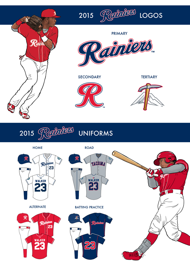
Taking over as the team’s primary logo is an updated version of the scripted “Rainiers” mark that was first introduced when Tacoma was first named the Triple-A affiliate of the Seattle Mariners in 1995. It is joined by a stand-alone scripted “R” logo that began as a fan favorite and now serves as the club’s secondary mark.
“This isn’t a typical team logo/uniform change,” said Rainiers Team President Aaron Artman. “This came from our fans. They wear more hats, shirts and other merchandise with the “R” on it than anything else, by a wide margin. And internally, we all love the look as well. So it just made sense to make the switch.”
The introduction of both logos ushers in the Rainiers latest on-field looks, as new road, home alternate and batting practice uniform combinations make their club debuts this season.
For the first time in franchise history, the Rainiers will roll out an all-red alternate jersey-hat combination that will be sported on both Sunday and Thursday home games throughout the season. The jersey features the primary “Rainiers” script logo labeled across the chest in white, along with white numbering and white piping lined along the seams and sleeves. The home alternate hat will also be cloaked in red with a scripted “R” logo positioned on the front in white.
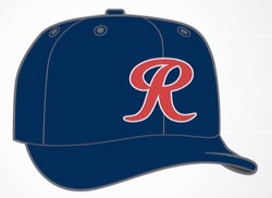
The Rainiers new road jersey was designed with the forefathers of Tacoma baseball in mind, and tips its cap to the Tacoma Giants of the 1960s with classic block letters that proudly spell “Tacoma” across the chest. The classic all-gray scheme will be topped by a navy blue hat adorned with a bold red “R” worn during games when the team is both home and away.
Capping off additions to the Rainiers logo and uniform sets is a newly-designed batting practice hat. The front features a mountainous outline meant to represent the namesake of the club, and is bisected by a climbing axe depicting a baseball bat-shaped handle. Along with its obvious visual connections to the club, the image was created to represent the team’s overall aspirations of ascending to the top.

