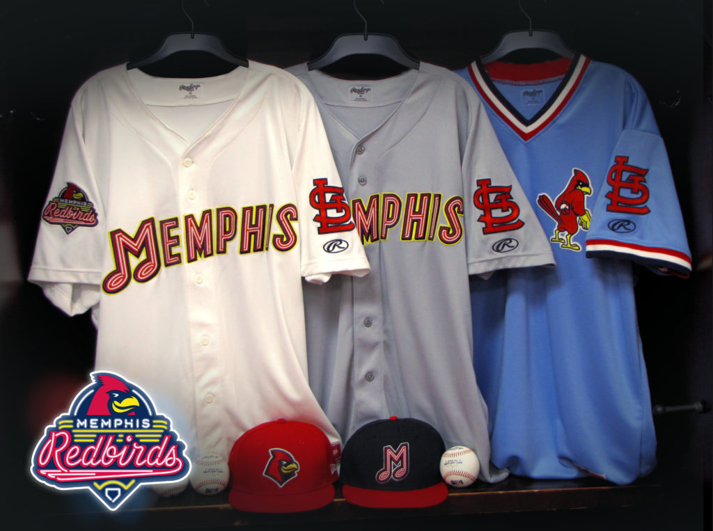
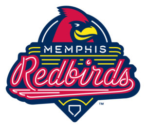
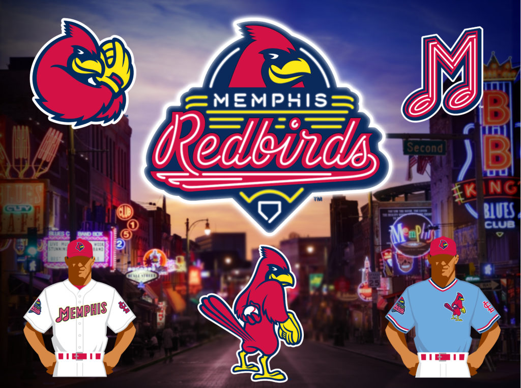
In an announcement on Wednesday, the Memphis Redbirds (Class AAA; Pacific Coast League) unveiled new logos for the 2017 season. Complete with new uniforms, the overhaul to the Redbirds takes inspiration from some Memphis landmarks as well as the team’s parent club, the St. Louis Cardinals.
The primary logo replicates that of a neon street sign, quickly calling to mind Memphis’ iconic Beale Street, located just a few blocks from the ballpark. The tube lighting is applied elsewhere throughout the brand package, including in the primary word mark and the numbers seen on the jerseys. Both the home and away uniforms feature the neon “Memphis” across the front with the neon “M” formed in the shape of a music note, to honor the home of the blues and the birthplace of rock ‘n’ roll.
“Upon purchasing the Redbirds, our first priority was to reconnect as a local business operating in downtown Memphis,” said principal owner Peter Freund. “In doing so, we felt we needed an authentic brand that represented not only the storied history of Memphis, but the heart of the city itself.”
“Throughout this process, we wanted to create a brand that we could activate,” said president/general manager Craig Unger. “The new, more modern look pays homage to Memphis’ rich baseball heritage while keeping the connection to our St. Louis Cardinals affiliation. We have achieved this balance by maintaining the Redbirds name and color scheme, but also bringing back elements such as the music note ‘M’ from the 1970s.”
In order to successfully capture this essence of Memphis, the Redbirds turned to Dan Simon of Studio Simon for design.
“We were tremendously excited when the Redbirds came to Studio Simon and asked us to work together with them to create a brand identity that celebrated Memphis in a manner that evoked the unique flavor of such an incredible city, one that is a destination in and of itself,” said Dan Simon. “And to be able to marry that look with a nod to, and update of, one of the St. Louis Cardinals’ wonderful heritage logos was certainly delicious icing on the branding cake.”
The primary colors of the new brand are St. Louis Cardinals red, navy and yellow, to represent the affiliate of the Redbirds since 1998. There are two primary hat versions: a red home hat featuring a more modern take on Rockey the Redbird’s head, and the iconic music note neon “M” on a blue hat with a red bill. Fans will note a faint yellow outline around the jersey elements, which gives the effect that the neon is turned on.
Rockey has also been modernized as an edgy, bold and determined character, which embodies the spirit of Memphians. And the Redbirds are proud to bring back an iteration of Rockey as the Cardinals’ famous “Dirty Bird,” which will be featured on alternate powder blue jerseys the Cardinals made popular during the 1980s.


