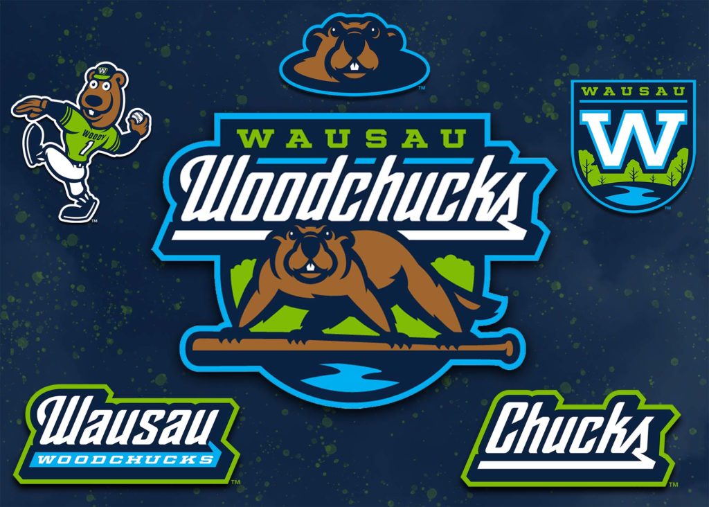
Big change for the former Wisconsin Woodchucks (Northwoods League), as the Wausau Woodchucks name is revived as part of new branding for the summer-collegiate team.
The team was originally the Wausau Woodchucks upon launch in 1994, so the new branding in a return to those roots. The new branding includes new logos, new team colors and updated character graphics from designer Studio Simon.
“The brand update will promote Wausau throughout the entire Midwest,” said team owner Mark Macdonald via press release, with all the Woodchucks television, radio, print and social media advertisements, including the posting of scores on the Fox Sports Ticker, will have the city of Wausau prominently displayed.
The new branding is the latest in the changes Macdonald has brought to the team and Athletic Park since taking over the team. Here’s a look at changes to Athletic Park from our last visit to Wausau.
Highlighted in the new branding:
- The Wisconsin River, which runs through Wausau and is only two blocks from Athletic Park, is featured in the bottom of the logo
- The trees behind the Woodchucks
- The modern looking Woodchuck, who is forward facing, ready to take on whatever comes his way
- Pops of bright blue and green
- Keeping the beloved Woody Woodchuck, while updating him and creating new artwork surrounding him that matches the new brand.
“This has been something we have been contemplating for several years,” Macdonald said. “We hope our fans are as excited about this update and the new colors as we are.”
