 We have some more logo news, as the rookie-level Appalachian League unveils a new look for the 2016 season.
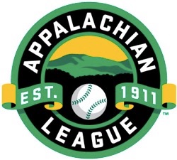
The league’s primary insignia, created by sports logo designer Todd Radom, features a circular design with the silhouette of the Appalachian Mountains behind forestation in the center of the logo.
“The goal was to create something timeless, but built with digital platforms and the varied needs of the 21st century firmly in mind,” said Radom. “The results embrace baseball’s time-honored visual culture with a verdant palette that celebrates the traditions of baseball, the sport of summer.”
“Our logo has served us well over the years, but it was time for a fresh look,” said Appalachian League President Lee Landers. “The design pays tribute to the Appalachian region and depicts the strength and stability of our league.”
The Appalachian League’s 10 clubs reside in the shadows of the Appalachians, with four teams in Tennessee, three in Virginia, two in West Virginia and one in North Carolina.