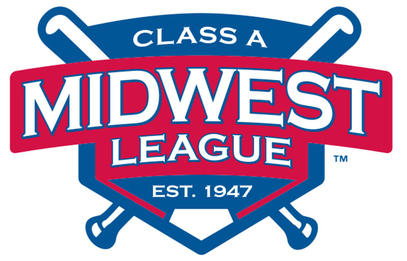
The Class A Midwest League unveiled a new look for the 2017 season, replacing a 32-year-old logo with one that combines traditional colors with an adaptable design.
“While the existing Midwest League logo served the league well, we, as a league, decided to create an updated identity going into our 71st season,” said Midwest League President Dick Nussbaum. “While keeping the traditional primary colors, we now can be immediately identified as the Class-A Midwest League, which was established in 1947.”
Once spread over three states, the Midwest League now features clubs in seven states (Illinois, Indiana, Iowa, Kentucky, Michigan, Ohio and Wisconsin) and annually ranks among the top leagues in Minor League Baseball in overall attendance.
As the logo committee set out to create and design the new logo, the Midwest League took the approach of making the logo bigger and bolder while keeping America’s red, white and blue the primary focus. “Midwest League” is now prominent in large white letters with a red background and establishes the league’s proud longevity. Two crossed bats and a home plate serve as the foundation for the logo.
In addition, all Midwest League teams are granted the flexibility to use the logo with their own team colors if it incorporates better with any promotional design concepts.
“Our approach in creating the new logo was to get our members involved and gather ideas and we then combined two of the concepts, blended them together, and created a strong and straightforward logo,” Nussbaum said. “We appreciate the guidance and feedback that Minor League Baseball provided from the start of the process to the release and it will be exciting to see the new logo proudly on display at all 16 Midwest League ballparks starting in April 2017.”


