
We have a new look for the Kane County Cougars (Low A; Midwest League), as the team unveils a new logo, uniforms, and more.
Creative direction for the new identity was led by Cougars graphic designer Emmet Broderick along with Studio Simon, a sports brand identity firm whose portfolio includes numerous professional sports franchises, collegiate teams and leagues throughout the world.
The focal point of the redesign is the Cougars’ new primary logo, which serves as a departure from the previous mark, which was relatively unchanged since the franchise began in 1991. A menacing, bat-clutching green-eyed Cougar with teeth visible is framed by the Kane County Cougars name and a wood-detailed park ranger-shaped badge. The outdoor landscape is reflected in the tree-lined background and is tied into the Fifth Third Bank Ballpark grounds, which are owned by the Forest Preserve District of Kane County. The “Cougars” furry script lettering incorporates the distinct look of a cougar’s tail in the letter “G.” The re-branded identity incorporates popular primary colors of navy blue, tan and bright green into the organization’s palette. Game and batting practice ball caps showcase secondary logos that build from the new primary logo, incorporating a rugged Cougars “C” surrounding the bat-wielding Cougar.
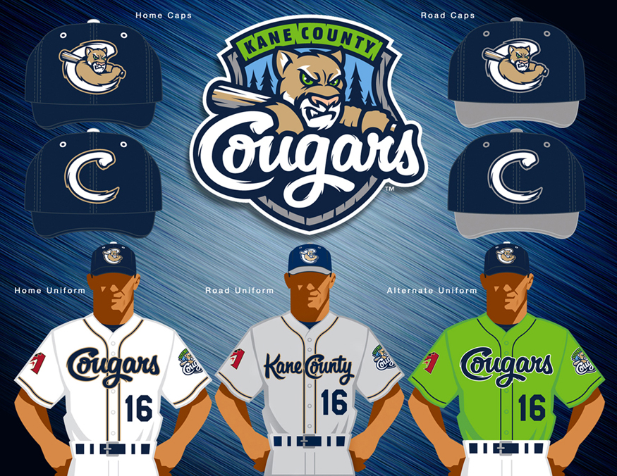
The primary logo will be prominently displayed on several of the new game jerseys beginning next season. In addition to white home, gray road and navy blue batting practice jerseys, the Cougars will also showcase a unique bright green alternate jersey with the “Cougars” script font. This specialty jersey will be worn by the team for select games beginning next season. Jersey sleeves highlight the Cougars’ new primary logo as well as the logo of the parent club Arizona Diamondbacks.
“Today’s announcement is one of great significance for our organization and really sets the tone for the 2016 season,” said Cougars Vice President/General Manager Curtis Haug. “With so many new aesthetic changes made visible for the first time today, it’s important to convey to our fans what is not changing: our philosophy of being the absolute best destination for fans of all ages to make memories while enjoying their experience at a Cougars game.”
“As we transition from our 25th anniversary season in 2015 into the next 25 years of Cougars baseball beginning in April, today’s announcement is an exciting time for everyone associated with the Cougars organization,” said Cougars owner Dr. Bob Froehlich. “The strong symbols and colors associated with our re-branded identity are modern, innovative and tell our story so well. We’re confident that fans will warmly embrace our new look. This truly is an exciting chapter in our history.”
“The Cougars brand has really been strengthened by our new identity,” said Cougars owner Cheryl A. Froehlich. “Opening Day will take on an added level of excitement when fans can see next year’s team displaying our new look for the first time.”