The Charlotte Knights (Class AAA; International League) unveiled new logos and branding to coincide with a move to a new ballpark for the 2014 season.
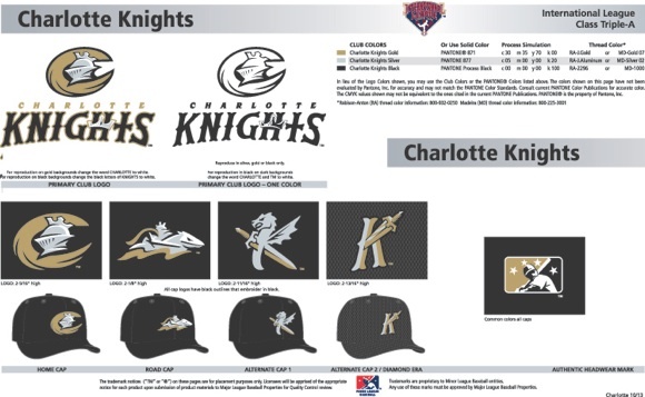
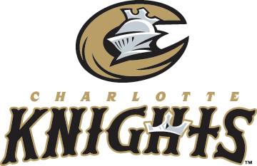
In keeping with a medieval theme, the Knights new image showcases gold and silver, colors synonymous with royalty. The team’s four on-field caps feature a base color of black with white accents, creating a classic combination of colors unique within Minor League Baseball. The font-style in the team’s word emblem “Knights” has an Olde English look similar to professional baseball’s Charlotte Hornets circa 1950.
“We are very pleased to reveal to our fans our team’s new identity as we prepare for our exciting move to Uptown Charlotte,” said Charlotte Knights Executive Vice President, Chief Operating Officer, Dan Rajkowski. “We wanted to take elements of Charlotte’s rich baseball history and celebrate the next era of our franchise. We are committed to the ‘Knights’ name and wanted to re-brand it as we take our next major step forward.”

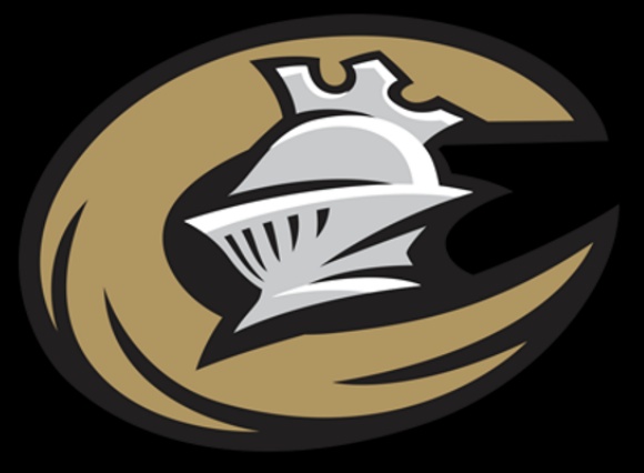
The Knight returns as the centerpiece of the team’s primary logo visible on the home cap. This design starts with a metallic gold-colored letter “C” in the form of a horse’s tail wrapped around a Knights armored helmet topped off with a crown signifying the Queen City of Charlotte. Queen Charlotte’s crown appears again in the team’s name in the letter “H.”
 The road hat incorporates a jousting Knight on horseback oriented horizontally across the front of the cap crown. Both the alternate and batting practice caps feature artistic versions of the letter “K” with swords. The alternate cap also introduces a dragon into the team’s portfolio.
“We view Charlotte as a big league city and spent more than six months working to find the right balance between a classic Major League look and the creative flair Minor League Baseball is known for,” said Knights General Manager of Baseball Operations Scotty Brown. “We’re thrilled to introduce a new look that includes symbolism and historical elements of the Queen City that our fans can be proud of.”
The Knights new look was brought to life by Brandiose. The development process began in February 2012 when company founders Jason Klein and Casey White met in Charlotte with fans, Knights staff and community members to learn about the region and the Knights. With input from all of these groups, Brandiose developed the new look like they have done for dozens of MiLB clubs and Major League Baseball’s Cincinnati Reds.
“With the excitement of the Knights returning to Uptown Charlotte, it’s the perfect time for a modern look,” said Brandiose’s Casey White. “Fans will love the clean, progressive look that celebrates the Queen City’s can-do spirit.”
—-
Share your news with the baseball community. Send it to us at editors@augustpublications.com.
Are you a subscriber to the weekly Ballpark Digest newsletter? You can sign up for a free subscription at the Newsletter Signup Page.
Join Ballpark Digest on Facebook and on Twitter!
Follow Ballpark Digest on Google + and add us to your circles!
