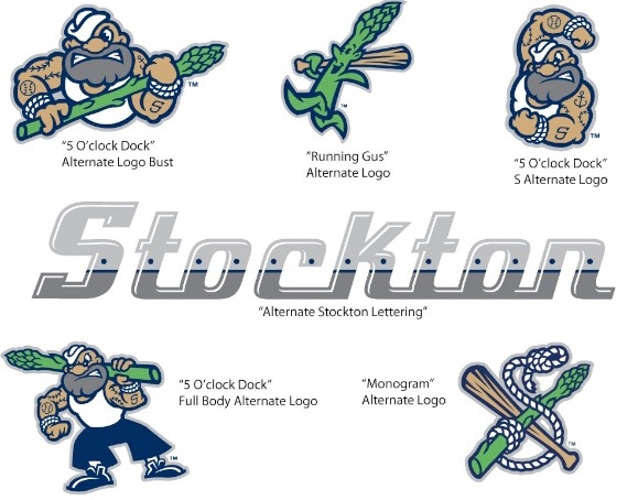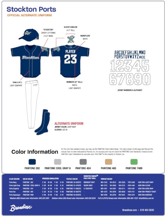
The Stockton Ports (High Class A; California League) released alternate logos and uniforms to be work on Fridays, with the new look combining city history with a popular food item sold at Banner Island Ballpark.
“This is truly an exciting way for the Ports to re-affirm our commitment to Stockton. We feel this new logo embodies the rich history and can-do attitude of our city,” said Team President Pat Filippone.
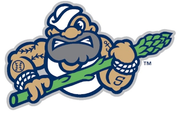
The Ports new logos honor Stockton’s heritage as the largest in-land port in California and the Asparagus Capital of the World. A new character, 5 O’clock Dock, is the centerpiece of the identity, brandishing his baseball tattoos and asparagus club. Navy, Shipyard Gray and Asparagus green make up the club’s new alternate colors. The Ports are the first professional sports team to use Asparagus green.

The alternate uniform feature navy tops with white trim and showcase the team’s riveted “Stockton” lettering across the chest. The new navy Alternate Cap features Stevedore Steve brandishing his asparagus club.

The development process began last June when Jason Klein and Casey White of Brandoise met in Stockton with fans, staff and community members to learn about the stories, history, and personality of the Ports and Stockton. Brandiose developed the logos, uniforms and is dreaming up enhancements for the 2013 fan experience.
—-
Share your news with the baseball community. Send it to us at editors@augustpublications.com.
Are you a subscriber to the weekly Ballpark Digest newsletter? You can sign up for a free subscription at the Newsletter Signup Page.
Join Ballpark Digest on Facebook and on Twitter!
Follow Ballpark Digest on Google + and add us to your circles!
