We have another new look for 2016, as the Great Lakes Loons (Low A; Midwest League) unveiled updated logos, wordmarks and jerseys for the upcoming season — the first refresh since the team moved to the Dow Diamond in 2007.
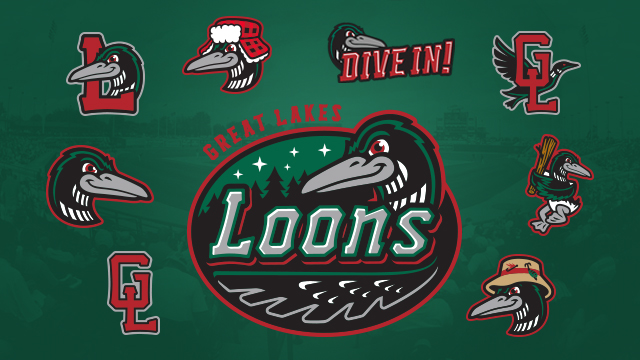
The Loons will have a multitude of logos in use, yet all are variations from the core set. From bottom left clockwise to bottom right: interlocking GL, Loon head, Loon L, Winter Loon, Dive In, interlocking GL with Loon in flight, Swinging Loon, Summer Loon. At the center is the Loons primary logo.
“With us heading into now our 10th season of Loons baseball, we felt it was time to freshen things up and build upon what we put in place when this organization started,” Loons President Paul Barbeau said. “It’s an evolution for us, as opposed to a revolution. If you look at what we did, we didn’t stray too far away from what we originally had. That’s why you will see a lot of similarities between the old and new brand because we liked what we had.”
The brand refresh comes from Brandiose, the San Diego-based sports branding company.
“Upon us reaching out to Jason Klein and Casey White at Brandiose, the ‘Discovery Process’ started in June of last year with them visiting us here in Michigan,” Vice President of Marketing & Entertainment Chris Mundhenk said. “They had the chance to work on surveys with our staff, lead focus groups with our staff and fans, along with visiting different parts of Mid-Michigan. They toured Midland and travelled to Bay City and Saginaw to get a feel for our region.”
From there, Klein and White took all of their findings and began sketching out options with different variations.
“As with any process like this, there was plenty of back-and-forth between us and Bradiose,” Mundhenk said. “We had a great working relationship with them and they really understood where we were trying to go with our brand.
“There’s a logo for every fan and we’re really tapping into what our entire region has to offer,” Mundhenk added. “The Winter Loon pays homage to all of our fans who are with us at the beginning of the season. When you look at where we’re located, it’s no secret it gets cold in Michigan and that it can spill over into the early part of the season. But you also have the Summer Loon for all of our fans who enjoy the diverse outdoor activities Mid-Michigan has.”
The main colors for the team will remain close to the same, with tweaks in areas. Desert Red, Green Bay Green, Metallic Black and Cool Gray will be the primary colors for the Loons.
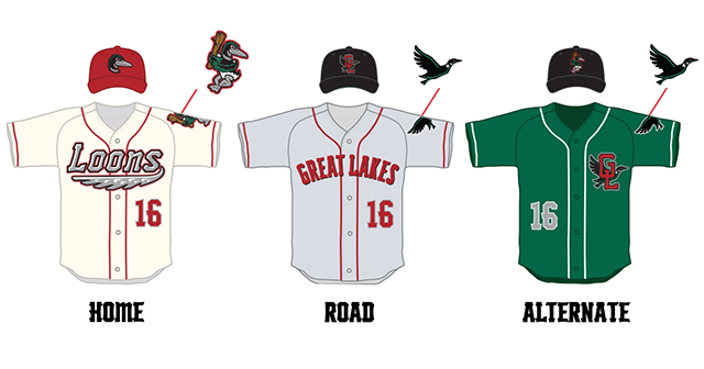
Home uniforms with the nostalgic cream color are an instant classic and harkens back to yesteryear. The road set is a classic gray with red lettering across the chest. The new alternates are green with the interlocking GL and Loon in flight anchored on the chest. All caps are the official New Era on-field hats with the road and alternates having the ability to interchange for select road games.
“We’re really excited about the vintage look we were able to capture with these uniforms,” Mundhenk said. “They strengthen what Loons baseball means to our fans and gives us a very clean, defined look.”
“Specifically with the cream, we’re going to be unique in Minor League Baseball using that as our primary uniform at Dow Diamond. The away logo is a classic look and has a distinct Loons feel while including the interlock GL and Loon in flight on the cap.”


