The Memphis Redbirds (Class AAA; Pacific Coast League) will have a new primary logo in 2015, adopting a look based on the iconic St. Louis Cardinals logo.
“We are extremely excited to debut our brand new logo to our fans and the City of Memphis,” said Redbirds General Manager Craig Unger. “The new logo ties together the rich tradition of the Cardinals organization and Memphis’ role in developing the future of Cardinals baseball.”
The redesigned uniforms will be debuted during the club’s exhibition game against the Cardinals on Friday, April 3 at AutoZone Park.
St. Louis Cardinals President Bill DeWitt III and the Cardinals graphic design team internally created the new color palette and logos, which replace Memphis’ original color scheme from 1998. It is the third complete logo redesign in franchise history and first since the 2007 season.
Memphis Redbirds Red, Memphis Redbirds Midnight Navy, and Memphis Redbirds Yellow make up the club’s new official colors and branding elements, which are identical to St. Louis. Yellow is a new addition to the unchanged Red and Midnight Navy from the club’s original eight-color palette scheme.
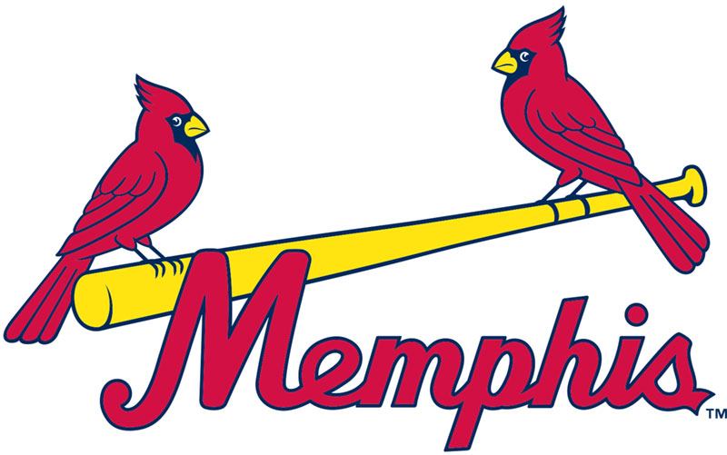
The new mark and colors pay tribute to the St. Louis Cardinals’ “birds on the bat” logo also worn by Advanced-A Palm Beach, Double-A Springfield, and now Triple-A Memphis.
The Redbirds will proudly sport hometown “Memphis” jersey lettering under the “birds on the bat” logo across both the traditional home white and road gray uniform jerseys. Matching pants with red belts, red socks, and red shoes remain unchanged from previous seasons. The birds’ beaks are changing from red to yellow to match the color of the bat.
In addition to the jersey changes, the team will wear red caps with their home uniforms, blue caps on the road, and alternate red-and-blue batting practice caps. All three hats will sport an updated “M” logo centered on the front.