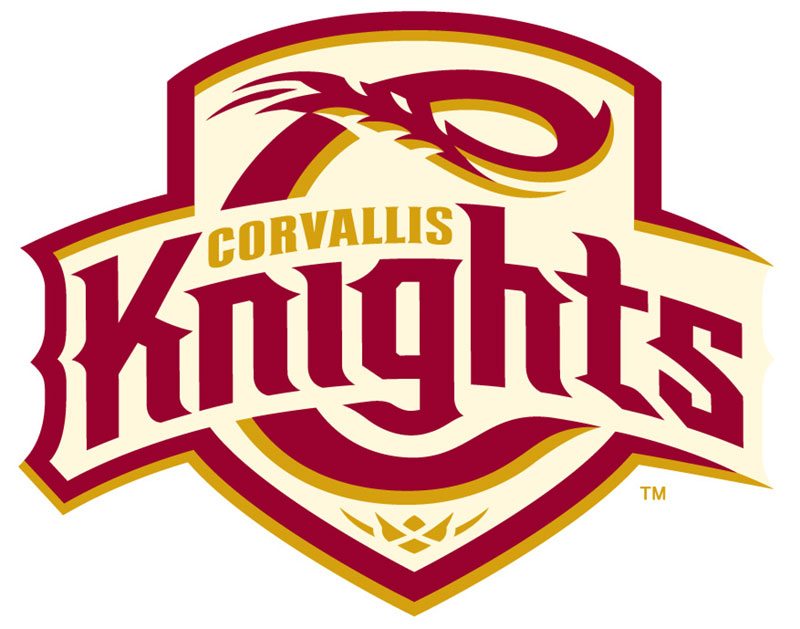
We have a new logo and colors for the Corvallis Knights (summer collegiate; West Coast League), as the team marks its “Golden Era” after 25 years of play.
The new team colors and a bold new logo come from San Diego-based branding company Brandiose to chart its new path. Designer Jason Klein of Brandiose said the new identity deftly celebrates the Mid-Valley’s rich agricultural roots by reflecting the independent spirits of the Corvallis/Albany/Lebanon/Philomath communities, their affinity for craft brewing, and Linn County’s reputation as the “Grass Seed Capital of the World.”
“The new Knights’ identity celebrates the ‘Seed Capital of the World’ as an area namesake,” Klein said. “Fans will love the incorporation of grain and seed into the Primary and ‘C’ logo. The medieval story is told through the shield and lettering, and the entire look is rendered with a sleekness that pays tribute to the Knights’ Nike heritage.”
Knights’ general manager Bre Miller said the new logo and colors are just the first of many changes to come as the team prepares for its ninth season at Goss Stadium at Coleman Field, another local institution undergoing an offseason paradigm shift with the addition of the new “Banners” hospitality deck and the installation of FieldTurf over the entire playing surface.
“As someone who was born and raised here, it’s not only energizing to unveil a new look, but rewarding to see our new logo connect with the community like it does,” Miller said. “Our golden era is here, and our new identity is just the beginning of a concentrated effort to deliver better overall experiences.”
Holly Jones, the Knights’ new Senior Vice-President of Operations charged with overseeing event operations, marketing, ticketing, analytics and food and beverage service, said she is thrilled with Brandoise’s work.
“We hope our fans and partners are just as pleased with our new brand,” she said. “It does a wonderful job encompassing who we are while reflecting our area’s agricultural roots and love of everything pertaining to brewing.”
The Knights will now have three official team colors, with “Get it Gold” and Corvallis Cream joining their traditional Classic Cardinal, a staple of Knights’ uniforms since our 2007 relocation. Here is a description of each color from Brandiose:
- Classic Cardinal: “The pillar of our color palette, this crimson hue is a thoughtful nod to the team’s history. This color exudes the playful energy of the Willamette Valley’s summertime weather while
also showcasing a reference to the rich pinot noirs birthed in our bountiful valley.” - Get it Gold: “An addition to our previous colors, this metallic hue injects energy and propels us into a new era for the Knights. A salute to both the area’s gorgeous daffodils and the team’s commitment to lofty standards, gold is truly a precious new element that we are thrilled to introduce.”
- Corvallis Cream: “The complementary aspect of our color palette, this tame cream is a direct reference to the Willamette Valley’s grain, seeds and barley roots. This color pulls together the bright tones in a down-to-earth and approachable manner, which is truly appropriate for this community’s open personality.”
The Knights did not forget their past while forging ahead to the future. The brainchildren of the original logo, Portland agency nonbox, will continue to offer their branding support and influence through production input from Mike Rougle, the team’s longtime graphic artist and designer.
President Dan Segel said the franchise’s rushed relocation from Gresham to Corvallis in late 2006 prevented the team’s front office from doing the appropriate market research to craft a logo that creatively tied the team to its new environs.
“Steve Flood of nonbox developed a professional and clean logo that got us started and served us well, but we did not have experience with the market at that time,” Segel said. “We didn’t have a chance to research the market either, in order to reflect our new community in our logo.”
That was corrected this offseason with a four-month campaign of formal online polling and direct conversations with partners and community leaders to learn more about their market.
“The results were interesting, but not surprising,” Segel said. “We operate in a market that includes disparate communities, most noticeably Corvallis and Albany.
“That made our branding work more challenging, but we feel like we featured what brings people together in this area, the similarities such as roots and passions.”
The public unveiling of the new logo and colors is today.
Brandiose, of course, is a leading branding firm serving the baseball industry. Partners Jason and Casey invented the first glow-in-the-dark on-field cap for the Casper Ghosts and the first on-field rally cap for the Altoona Curve. They dreamed up top selling logos for the Richmond Flying Squirrels, Lehigh Valley Iron Pigs and America’s oldest baseball club, the Cincinnati Reds.

