It was an edgy approach to a new team identity, but the unveiling of new Akron RubberDucks (Class AA; Eastern League) logos and marks certainly led to a successful 2014 for the team — making them our choice for Best Logo/Branding in our annual awards.
“Rubber plays a huge role in Akron’s history, and this branding pays homage to that history while updating the look for today,” said Kevin Reichard, Ballpark Digest publisher. “With the rubber duck being invented in Akron, the new logo and marks were a perfect match for the market and helped revive the Eastern League franchise.”
“We are humbled and honored to be recognized by Ballpark Digest as having the Best New Logo of the Year. There were a lot of great new logos and identities this season and we are thrilled to receive this honor,” said RubberDucks General Manager Jim Pfander. “When we approached Brandiose about helping us create a new brand for the Akron community, we knew we were dealing with the best in the business and have been thrilled with the results after the first year. The Akron RubberDucks brand means so much to the greater Akron community and it encompasses our vision of creating affordable, family fun for our region.”
“As the Original Rubber Capital of the World, Akron takes its place as one of the great cities that helped build America,” said Brandiose’s Jason Klein. “The RubberDucks identity is a tribute to the tenacity and ingenuity of the people of Akron.”
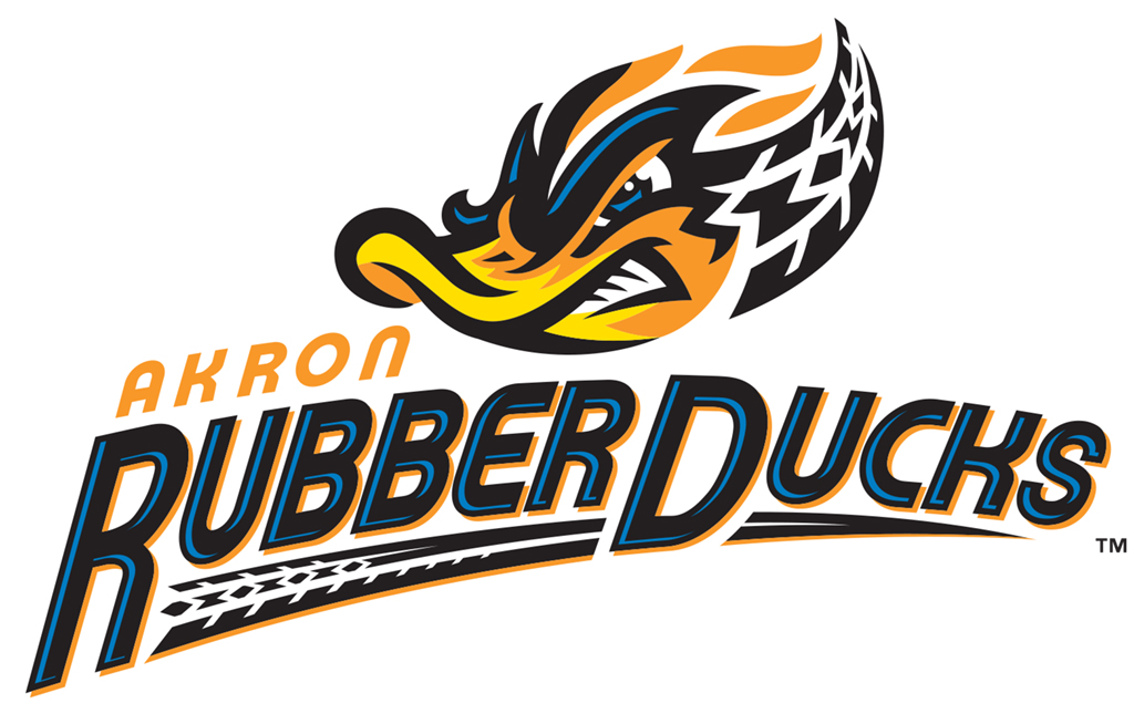
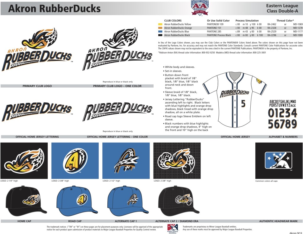
The new branding is centered on a tenacious, tire-treaded RubberDuck surrounded by burn-out flames. The primary logo features the RubberDuck with the team moniker “RubberDucks” in a tread-style font.
Blue Flame, Racing Yellow, Fire Orange and Tire Black comprise the club’s new official colors, paying tribute to Akron’s rubber heritage while celebrating the family-fun entertainment of Minor League Baseball. The Akron RubberDucks were the first professional baseball team to use this color combination.
The new logo and branding were a core part of the franchise’s makeover, which also included improvements to Canal Park and upgraded concessions. The makeover resulted in a 15.7 percent attendance rise in 2014 over 2013 at Canal Park, as this season’s total attendance was 350,704 in 68 openings.
“Our fans responded in a big way throughout the first season as the RubberDucks, embracing the new look and feel for our new identity,” Pfander added. “We are creating something special in Akron and as evidenced by the attendance surge over the past two years, our fans have spoken. Our goal was to create a brand that honored Akron’s heritage and history, but also something fun for kids in which they could relate. While we’ve made a great first step, we still have a long way to go to get the message about affordable, family fun to folks all over Northeast Ohio.”
“Last season was unquestionably a successful one for the RubberDucks, Jim Pfander, Ken Babby and the rest of the front office,” Reichard said. “The new logo and branding was clearly a part of that. At the end of the day, how the fans respond really determines whether a new look is successful – and the fans clearly returned to Canal Park.”
For more information, check out the Akron RubberDucks and Brandiose websites.
We also wanted to mention some other new logos and marks worthy of mention:
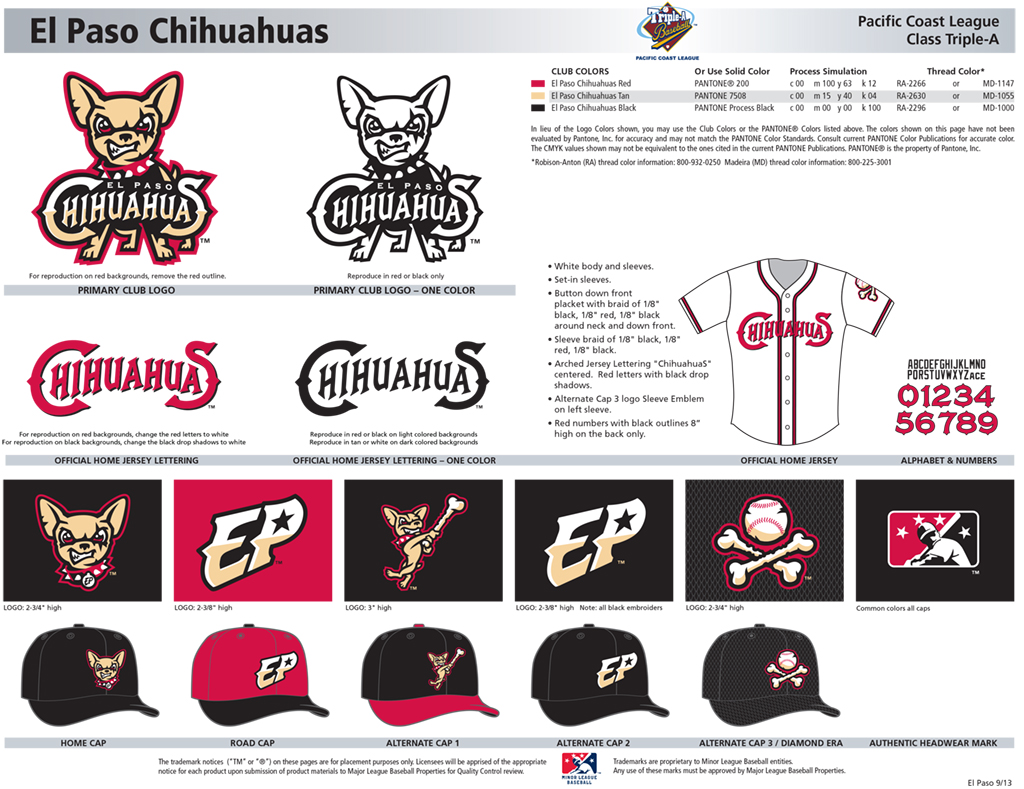
The El Paso Chihuahuas (Class AAA; Pacific Coast League) came strong out of the gate with a strong logo and mark built around — what else? — a chihuahua in various poses. That brand was used well when it was the centerpiece of Bark in the Park, a noteworthy promotion that put the face of a chihuahua on the team jersey in a most unique fashion. It was also effectively used for promotion, in-game entertainment and more. The design came from Brandiose.
The Kenosha Kingfish (summer collegiate; Northwoods League) combined a strong mark from Shine United with a branding campaign built around the King, Elvis Presley. A Kingfish mascot, complete with crown and flowing cape, was a hit at Simmons Field. The team mascot, King Elvis The First, is a clever combination of a crowned fish wearing a white jumpsuit a la thin Elvis. Elvis-themed concessions are on the menu. And the grounds crew – who also help out directing traffic before a game – are outfitted in the same white jumpsuits, augmented with sunglasses and Elvis wigs. With a ship built into the outfield wall at Simmons Field, the theme was complete.
The Kalamazoo Growlers (summer collegiate; Northwoods League) also started out of the gate with a strong new logo and team identity from Worthen Design, one that also works on multiple levels. On the one hand, bears can be heard growling in the wilds of Michigan. On the other hand, the Growler name is an homage to the rich history of microbreweries originating in Kalamazoo. A growler is a glass or ceramic jug used to transport draft beer frequently sold at craft breweries, microbreweries, and brewpubs. Growlers are a staple in breweries because of their ability to hold carbonation indefinitely, and for upwards of a week when first opened. They can also be refilled when empty. Most recently, Beer City USA ranked Kalamazoo as the #2 craft beer city in the country right behind Michigan’s own Grand Rapids.
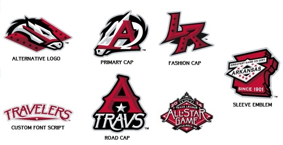
The Arkansas Travelers (Class AA; Texas League) unveiled new logos and branding, drawing on the design of the state flag and other state icons, paying tribute to the Travelers’ 112 year-old storied history. The centerpiece of the identity is a new horse head chiseled from Arkansas State Capitol Building limestone. Several logos feature elements from the iconic Arkansas flag, and a new Sleeve Emblem marks the Travs 1901 foundation and the team’s famous slogan, “Greatest Game on Dirt.” The series was done by Brandiose.
