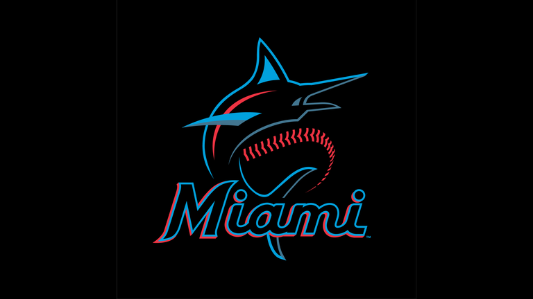
The Miami Marlins have made a major overhaul to their branding, as they have unveiled a new color scheme and logos.
In the lead up to Thursday’s announcement, the team had actively teased the changes on social media. The new branding represents a vast departure from the club’s former logo, which featured a block M with rainbow colors.
Miami’s new colors are: Caliente Red, Miami Blue, Midnight Black, and Slate Grey. The logo and colors aim to capture the rich baseball history, diversity, and energy of the area. The pairing of Miami Blue and Caliente Red pop off of the base color of Midnight Black, energizing the script and giving the logo an electric and vibrant look — emblematic of the Miami energy and nightlife.
The styling of the modern script “M” and curved tapered serif font is a classic approach influenced by the typography commonly found among the Latin-American culture. The look has as much to do with the infusion of the local Hispanic culture as it does with the history of baseball in Miami as the font style and accent colors are a throwback to the Miami Marlins and the Havana Sugar Kings of the 1950s.
The primary logo features a marlin drawn to be much more athletic and powerful. It has an upward body position to capture its strength, speed, and legendary fighting spirit.
The branding changes will continue Friday morning with the official unveiling of the club’s new uniforms. Branding changes mark another new element for the franchise that will be in place next season, along with upcoming renovations to Marlins Park.

