We have a new look for the Bowling Green Hot Rods (Low A; Midwest League), as the team unveils new colors, redesigned logos, jerseys and hats for the 2016 campaign.
The new look was created by New York-based design firm SME Branding, which has worked on other notable brands like the Miami Marlins, Los Angeles Galaxy and the Atlantic Coast Conference.
“We partnered with SME Branding when we purchased the Reno Aces and we knew they would be the perfect fit to help us create and redesign the Hot Rods brand,” said Hot Rods owner Stuart Katzoff. “Maintaining the Hot Rods name was imperative to the project, but we really wanted to create a more modern, rejuvenated look for the team.”
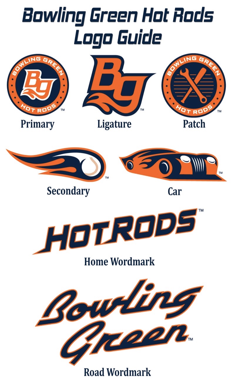
The most noticeable difference to the new look is the colors; the Hot Rods marks will now sport a navy and orange theme. The navy ties into the team’s home state nickname of the “Bluegrass State” while the orange remains consistent of the styling of a hot rod.
The new primary logo is a circle containing “Bowling Green Hot Rods” in the outer circle, while a redesigned “BG” mark is the focal point. The “BG” mark has been updated, removing the tailpipe flames from the top of the “B” as it was featured in the old logo, to where it is now featured on the bottom of the “G.” The new flames are also more arched and curved to depict the rolling hills of South Central Kentucky.
“We knew going into this project that there were characteristics from our old brand that we wanted to keep. The ‘BG’ and car logos were two that we felt were iconic enough with our brand to include in the updated version,” said Hot Rods General Manager Adam Nuse. “The new color scheme provides us with a more modern look while still embracing the team’s heritage.”
The new primary logo will be accompanied by four alternate logos and two new wordmarks used on the jerseys. The previously described “BG” will serve as the team’s ligature mark. The iconic Hot Rods car has been revamped into a sleek new street rod. A baseball inside a tailpipe flame will serve as the secondary logo for the team. And playing off the design of the primary logo, the new patch logo features the same outer circle design with a cross wrench and bat design in the middle. The Hot Rods home wordmark features sleek tailing letters and is designed in an upward motion. The new road wordmark features Bowling Green written in stylistic lettering representative of the original Corvette.
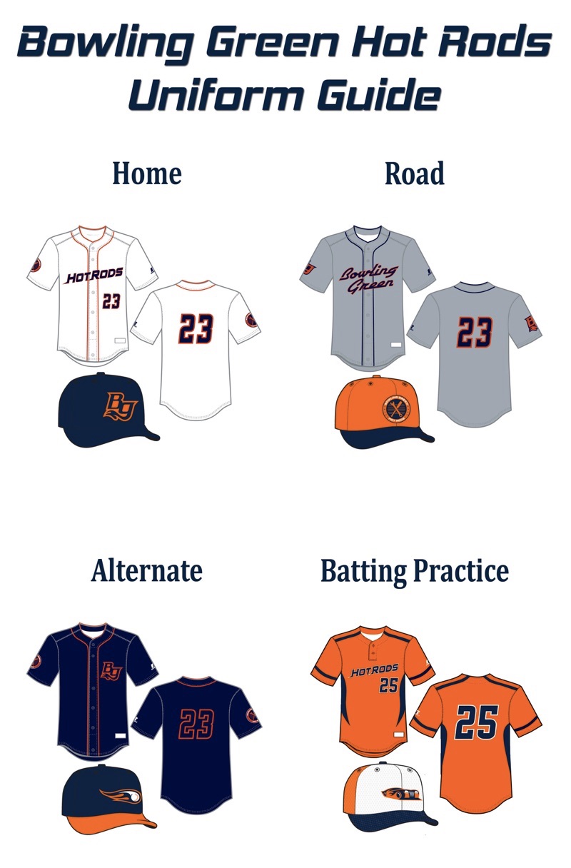
The new logos and colors will be represented in the Hot Rods onfield apparel for the 2016 season. Each jersey features a solid color with contrasting piping which has been altered into a double piping instead of the traditional single piping. he Hot Rods will sport three jerseys: the classic home white features orange piping with the Hot Rods wordmark and jersey number on the front in navy blue with an orange outline. The Hot Rods patch logo will be featured on the right sleeve. The road jersey is gray with the Bowling Green wordmark in navy blue outlined in orange, navy piping, and the BG ligature on the right sleeve. The alternate jersey, which can be worn at home or on the road, is navy blue with the BG ligature in orange on the left chest, orange piping and the patch logo on the right sleeve.
In addition to the new jerseys, the Hot Rods will also have four official on-field caps to wear. The home cap is navy blue with the BG ligature in orange. The road cap is orange with a navy bill that features the patch logo. The alternate cap is navy blue with an orange bill and sports the “baseball and flames” secondary logo. And the batting practice cap is a tri-color design with a white front, orange back and navy bill. The updated car logo is featured on this design.
“We are really excited about the work that SME Branding did on our logos and are really proud to share it with our fans not only in South Central Kentucky, but to all Minor League Baseball fans,” Nuse said. “We are ready to kick off a new era in Hot Rods baseball that is FanDriven and our new look is just the beginning of great things to come with this franchise.”


