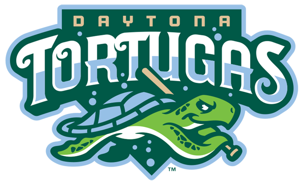
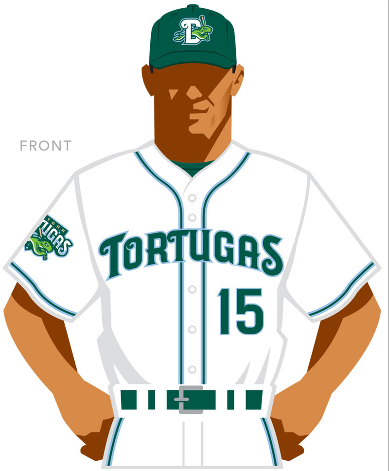
When an affiliation change forced Daytona’s baseball team to revamp its branding, the resulting Daytona Tortugas name and logo ended up launching the best new look in baseball, as chosen by the editors of Ballpark Digest.
Daytona’s Florida State League team turned lemons into lemonade after circumstances forced the team to quickly adopt new logos and branding after an affiliation change. The resulting Daytona Tortugas look was named Best New Logo/Branding of the Year in the 2015 annual awards from Ballpark Digest, the leading guide to ballparks and baseball on the Internet.
“Most fans don’t realize how long it takes to launch a new brand and marks for a professional sports team,” said Kevin Reichard, Ballpark Digest publisher. “The normal lead time was highly compressed for the Daytona ownership and management. That they and their design team came up with such a strong team name, logo, and marks is a true testament to their hard work and inspiration.”
“What a great way to cap off our first year as the Daytona Tortugas! Our staff along with Studio Simon did an excellent job with the rebrand especially given the circumstances,” said Daytona Tortugas GM Josh Lawther. “The buy in both locally and even nationally has been a rousing success and Tortugas Nation will only continue to get bigger.”
The logo and branding from Louisville-based Studio Simon was made necessary when the team’s longtime parent, Chicago Cubs, decided to leave the Florida State League, replaced by the Cincinnati Reds as a parent team. The loss of the club spelled the end of the Daytona Cubs, meaning Studio Simon and the Daytona front office needed to act quickly to initiate new branding for the 2015 season.
“There wasn’t much time to implement the new look,” Reichard said. “But the resulting Daytona Tortugas name and branding really fit the market. It was a success on all levels.”
Daytona was not the only notable rebranding for the 2015 season. Also worthy of recognition:
- The Frisco RoughRiders (Class AA; Texas League) unveiled a new logo and branding identity based upon former U.S. President Teddy Roosevelt, America’s original Rough Rider. The new look, featuring fresh logos, team colors and uniforms from design firm Brandiose, was part of a six-month creative overhaul of the RoughRiders’ brand, and a major move under new ownership. Attendance was up 5 percent in 2015, and the team led all of Class AA in attendance. This wasn’t the only big change for the RoughRiders this season; you’ll see the team listed as we announce more awards this month.
- The South Bend Cubs (Low A; Midwest League) went against the branding tide and proudly embraced the name and colors of their new parent, Chicago Cubs, while putting their own twists on the logo and the uniforms. The moves worked: attendance was sharply up again this season.
- The Pulaski Yankees (rookie; Appalachian League) made a new team name part of a franchise overhaul that saw new ownership and Calfee Park renovations. Attendance was up over 100 percent in 2015.
PREVIOUS 2015 AWARD WINNERS:
Best New Ballpark: CHS Field, home of the St. Paul Saints


