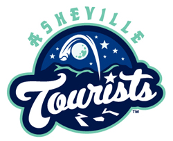
 Drawing on the colorful history of baseball in the area and the scenic nature of McCormick Field, the Asheville Tourists (Low Class A; Sally League) unveiled a new logo, color scheme and identity.
“We’re extremely excited to introduce our new identity program,” said Brian DeWine, president of the Tourists and DeWine Seeds Silver Dollar Baseball. “During the 2010 season, we formed a working relationship with Plan B Branding and proceeded to meet with fans and other members of the community to try to incorporate a true local feel to what we were trying to accomplish. Plan B did a great job of putting everything together and developing the unique concept.”
The ball going over the moon has multiple meanings in the new identity. First, it hearkens back to the earliest days of Asheville baseball, when the Asheville team in the Class D Southeastern League (1910) and the Appalachian League (1911-12) was known as the Moonshiners. The color schemes, meanwhile, pay tribute to the city’s hallmarks, including Midnight Navy, Blue Ridge Blue and Biltmore Jade. A new typeface, which will be used for both “Asheville” and “Tourists” as well as the “A” on caps, was rendered in the area’s craftsman style.
You can view a logo sheet here.
You can view a cap guide here.
You can view a corporate logo and identity guide here.
The new caps consist of four different styles. The new dark navy home cap features the Mr. Moon logo glowing in the dark. The road caps are indigo blue with a snow-white A. The alternate caps, which will be worn for home games on Thursdays, Saturdays and special days, have an indigo crown, a dark navy bill and an A with the stars and mountains logo. The batting practice cap is Midnight Navy with a full-body version of Mr. Moon swinging a hobo briefcase.
“Our number one goal was to create an exciting new look for our fans and the community that they will be proud to wear,” DeWine said. “While we’ll introduce our uniforms in the spring, we couldn’t wait that long to get our caps in the hands of our fans so that they too can share in the excitement that we feel for our new identity.”
The team’s new primary logo features a home run ball sailing over the Blue Ridge Mountains above the refreshed “Tourists” script. The team also unveiled a new McCormick Field logo, which is shaped like home plate and includes the ballpark’s arched entrance along with the moon, stars and its first year—1924.
Share your news with the baseball community. Send it to us at editors@augustpublications.com.
Subscribers to the weekly Ballpark Digest newsletter see features before they’re posted to the site. You can sign up for a free subscription at the Newsletter Signup Page.
Join Ballpark Digest on Facebook and on Twitter!
