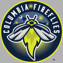
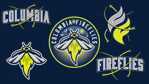
As chosen by the editors of Ballpark Digest, the 2016 award for Best New Logo/Branding of the Year belongs to the Columbia Fireflies (Low A; Sally League). The Fireflies partnered with sky design to launch their inaugural season with a look that balances innovation and community connection, creating an identity that turned into an instantly beloved classic.
“At a time when outrageous team names and logos are part of the pro baseball experience, it’s refreshing to see a name like the Columbia Fireflies be a success and stand out in the crowd,” said Ballpark Digest publisher Kevin Reichard. “That team name is carried out brilliantly in Spirit Communications Park, adding a subtle bit of nostalgia to the fan experience.”
“Our goal in selecting a name for Columbia’s team was that it be local, unique and fun,” said Fireflies team president John Katz. “We researched ourselves, worked with our brand team from sky design and solicited input from the community. The process from start to finish took almost a year. We fell in love with the concept of the ‘Fireflies’ brand and the great colors we knew that would allow us to work with. Our team from sky design captured the glowing nature of our iconic firefly with a combination of subtle hues, neon and even glow-in-the-dark components. The end product is something that we are all extremely proud of.”
“We had a lot of ideas for the branding in Columbia that we were excited about,” said sky design vp/principal Todd Vaught. “As the Fireflies idea gained traction, we really started to fall in love with how the brand connected with the ‘famously hot’ city, unique color scheme, the glow in the dark elements and the whole idea of connecting the rebirth of professional baseball in Columbia with the bygone days of capturing fireflies in a jar on a warm summer night.”
The Fireflies joined the Casper Ghosts (2008-2011; now the Grand Junction Rockies) as the only teams in Minor League history to wear glow-in-the-dark gear. Their colors were chosen in a more subtle fashion, reported The State’s Aaron Ransdell on August 4th, 2015, with their midnight blue symbolizing the sky above South Carolina coupled with the fluorescent firefly glow. A crescent hides in the top left of the logo, the same location as the crescent in South Carolina’s state flag. Interestingly, though, it was a different logo for the team that garnered even more love.
Previous 2016 Award Winners:
Best Ballpark Renovation (Over $10 Million): The Outfield Apartments
Best Ballpark Improvement (Over $1 Million): The Choctaw Lazy River
Best Ballpark Improvement (Under $1 Million): The Perch
Broadcaster of the Year: Sean Aronson, St. Paul Saints
Ballpark of the Year: Spirit Communications Park


