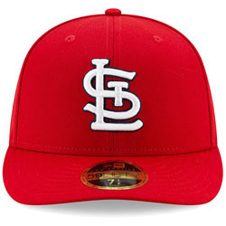
The St. Louis Cardinals have made slight tweaks to the interlocking STL logo on their caps, changes that were prompted by planning for an upcoming selfie spot at Ballpark Village.
The Cardinals and Baltimore-based The Cordish Companies are in the midst of a $260-million expansion of Ballpark Village, the mixed-use development located outside Busch Stadium. One of the amenities that the Cardinals will add through that expansion is an oversized STL logo, which will be located in an open space of the development and give the area a new selfie spot.
As they planned the design of the selfie spot, Cardinals officials–including president Bill DeWitt III–began to realize where the logo itself could be improved. The result is a series of changes that will be apparent on the team’s caps in 2020, including a balanced S, rounded edges in each letter, and more. This design will also be used for the selfie spot, making it safer. More from the St. Louis Post-Dispatch:
“It looked sharp in the drawings,” said Bill DeWitt III, the club’s president. “It comes to this super sharp point, and we can’t have that if people are going to be moving around it, and not if it’s the same at the bottom (by feet). Then I looked. Why isn’t it at the bottom of the ‘S’?”
In the past 20 years the Cardinals have tightened and sharpened and enhanced the detail of the redbirds in their logos – from the intricacies of the stitching to even the color of the beak – but the interlocking STL, the logo on the hat, has experienced an erosion over time. It’s dropped a serif here, added a point there, thinned the ‘T’ to a couple a sticks, added a trapezoid atop it, and, in several ways, become a patchwork of itself.
When the team wanted to build a large logo for the centerpiece of an open space at Ballpark Village, DeWitt saw so many of the irregularities, starting with the flat tail of the ‘S’ and the sharp point at its top. He wanted to restore balance to the logo.
“We want to drive the logo back to its original merits,” DeWitt said. “And we wanted to make sure it be consistent from here on, year to year.”
Changes to the emblem are subtle, though they amount to a notable tweak to one of Major League Baseball’s most recognizable cap logos. The Cardinals put the logo out through a soft launch in 2019 that consisted of using it for television graphics on Fox Sports Midwest, displaying it on a wall outside the home clubhouse, select giveaways late in the season, and more.
Image courtesy St. Louis Cardinals.

