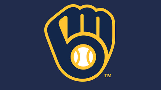
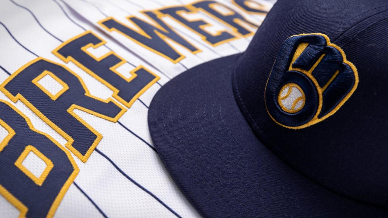
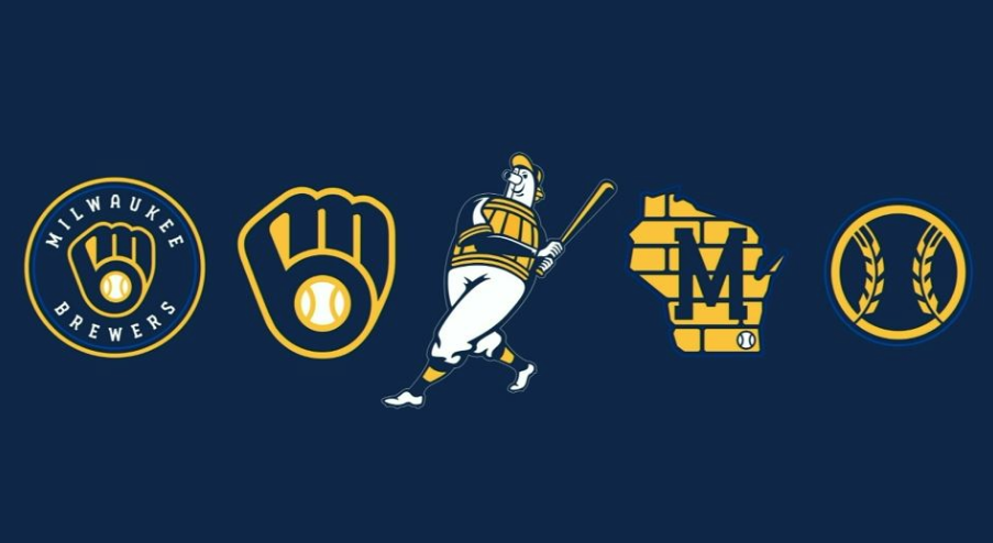
The Milwaukee Brewers have unveiled a new logo and uniforms for the 2020 season, highlighted by a modernized version of the ball-in-glove emblem that was first introduced in 1978.
“This is an exciting day for the Milwaukee Brewers and our fans as we usher in this next generation of Brewers baseball,” said Brewers Principal Owner Mark Attanasio. “As we reflected back on fifty years of the Brewers in Milwaukee, we turned to the past to inform our future. Our fans, our city and our state have been the fabric of our franchise since 1970, and they are the inspiration for our new look.”
The core of the Brewers’ new look, which was designed with RARE Design in Hattiesburg, Mississippi, is a logo which combines a reimagined ball-in-glove icon in the center, as an emblem of Brewers fans as the core of this organization, with elements of the original Barrelman logo – a circular lock-up with “Milwaukee Brewers” featured at the top and bottom. Royal blue is subtly featured in a ring around the logo’s border, paying tribute to the original ball-in-glove era.
Modernized for the next generation of Brewers baseball, the new ball-in-glove logo pays homage to the original design. Subtle changes have been made, with the “M” and “B” now linked above the glove’s webbing, signifying the unbreakable connection between the Brewers and the city. The ball is now more reminiscent of a traditional baseball, featuring two vertical seams dividing it into three segments – representing the city, the state and the largest segment, the fans.
“This was a special process to be a part of for the Milwaukee Brewers and their fans,” said Rodney Richardson, founder of RARE Design. “Our goal was to develop a brand identity that depicted the story of the Brewers and their fans and characteristics of the city and state they call home. The result is a new look for the team which represents the history of this franchise and the vision for its future.”
The team’s new color palette is anchored by navy, which the Brewers have proudly worn since 1994. Accompanying navy are the colors yellow and royal blue. The yellow represents our city’s rich brewing legacy and joyful nature, while the royal blue represents the era that produced two postseason berths and a World Series appearance.
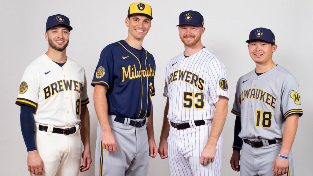
The Brewers’ new primary home uniforms are cream colored – representing the “Cream City” – and feature elements from the team’s original jerseys, including a thick sleeve trim. Home uniforms will also include a modernized version of the Brewers’ original pinstriped set from 1978-89, updated with the team’s new color scheme, typography and mark.
New gray road uniforms proudly read “Milwaukee” across the chest and feature a Wisconsin state patch on the sleeve that has been refreshed to include Cream City brick, an industrial block “M” and a baseball representing Milwaukee’s location. In addition to a new navy alternate jersey, which features its own unique “Brewers” script, the team’s alternate road uniform will be highlighted by a two-tone hat as a nod to the hat worn from 1978-84.
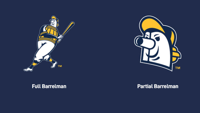
In addition to an updated Wisconsin state patch, alternate marks will include a refreshed Barrelman and a brand new wheat ball logo inspired by Milwaukee’s brewing tradition and the wheat featured in Brewers logos since 2000.
“We have the privilege to play for the most passionate supporters in the country, fans that inspire us, and restoring this iconic logo is our way of paying homage to this storied relationship we have with them,” Attanasio said.
Images courtesy Milwaukee Brewers.

