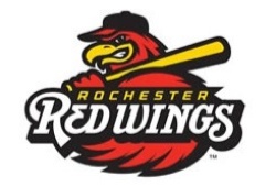
 The Rochester Red Wings (Class AAA; International League) unveiled a new look, with the iconic Spikes updated for 2014.
“Our Spikes logo has been a beloved one for us, with great popularity both locally and nationally with souvenir sales across every state in the country,” said Red Wings President/CEO/COO Naomi Silver. “In keeping with the times, we’ve decided to take this logo and give him a super update to get a whole new generation of fans excited about his look. We think this new version will be a real hit with our fans.”
Spikes, a fan-favorite within the community since the Wings moved to Frontier Field in 1997, will remain the focal point of the Red Wings new primary logo which will serve as the Red Wings official trademark and will appear on all marketing efforts as well as merchandise.
Always an intimidating character to International League opponents, Spikes has spent more time than ever in the weight room since the Wings’ season ended in early September and the results are evident in his new look. In the primary logo, the new Spikes now glares across his colossal left arm with a ferocious look while holding a baseball bat over his shoulder. To complete the primary logo, the word mark “Rochester Red Wings” appears across the bottom half.
“This marks an exciting time in our ballclub’s history,” said Dan Mason, Red Wings general manager. “Over the years, the Red Wings have had some iconic logos and we feel the new and improved logo will be another in a long line of trademarks that have served our fans and our players well. We are very excited about Spikes’ makeover.”
While the Red Wings new uniforms won’t be introduced until later this offseason, the Wings did reveal their new home, road and batting practice caps on Friday. Each cap is unique in that each represents a different era in Red Wings baseball.

The new home cap, to be donned by Red Wings players at Frontier Field, represents the newest era in Rochester baseball history as it features the fierce stare of the new and improved Spikes on a black cap with a red bill.
Reminiscent of the cap worn by the Wings over the last 17 seasons at Frontier Field, Rochester’s new road cap includes the new look Spikes, with an “R” on his chest, holding a baseball bat horizontally across both shoulders. This logo, outlined in white, is set on a red hat with a black bill.
Rochester’s new batting practice cap pays homage to the great Red Wings teams during the Silver Stadium era. The red, polyester, moisture-wicking hat with a black bill features a white, script letter “R” outlined in black. The letter “R” has adorned the uniforms or caps of numerous Governors’ Cup winning Red Wings teams – including arguably the greatest team in franchise history, Joe Altobelli’s 1971 squad.
The Red Wings’ new logos were designed by Dan Simon and his team at Studio Simon based in Louisville.
—-
Share your news with the baseball community. Send it to us at editors@augustpublications.com.
Are you a subscriber to the weekly Ballpark Digest newsletter? You can sign up for a free subscription at the Newsletter Signup Page.
Join Ballpark Digest on Facebook and on Twitter!
Follow Ballpark Digest on Google + and add us to your circles!
