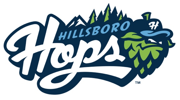
It was the perfect look and perfect marketing for a beer-crazy region: The Hillsboro Hops (short season A; Northwest League) have won Best Logo/Branding in the 2013 Ballpark Digest Annual Awards.
If you were to pick an area that typifies America’s love affair with craft beers, it would be the Pacific Northwest, home to hundreds of breweries and brew pubs. And, of course, we all know how baseball fans love their beer. So while it was a natural for the new Hillsboro team to adopt beer-related branding, the end result — the Hillsboro Hops – surpassed expectations and was an easy choice as the Best Branding/Logos of 2013 by Ballpark Digest.
“Professional baseball at all levels is notable for its branding efforts in recent years, but the Hillsboro Hops branding was one of the best efforts we’ve seen in years,” said Kevin Reichard, publisher of Ballpark Digest. “The logos and branding played well both locally and nationally and should serve the team well for many, many years.”
A hop is a prime ingredient in beer, one of the only three allowed under German purity laws. Hops are a major crop in the Pacific Northwest, particularly in the Willamette Valley, and shipped to brewers big and small across the country. And, of course, there’s a baseball-related twist to hop, whether it be a bad hop or a one-hop catch. Add to these meanings an attractive logo and brand identity from Studio Simon, and you’ve got one of the best brand identities in all of baseball.
“When we decided on the name ‘Hops’ we were hoping it would be a name that our fans and the local community took pride in,” said Hillsboro Hops VP and GM K.L. Wombacher. “To receive national recognition beyond the excellent local reception we’ve had to the brand is far more than we could have hoped for. We’d like to thank Ballpark Digest for this award and for the great coverage they provide to minor league baseball.”
“The Hops enjoyed a successful debut in Hillsboro in 2013, and the branding was a huge part of it,” Reichard added. “Hops merchandise should be one of the best-sellers in baseball for years to come.”
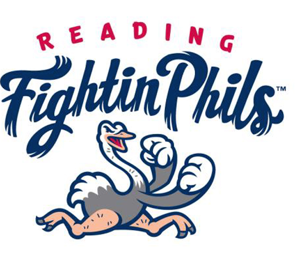 Our runner-up: the Reading Fightin Phils (Class AA; Eastern League), who with Brandiose took the Reading Phillies name and gave it both a new look and a retro feel. Despite some initial bad feedback to the name change and logo makeover, Over time, the name grew on us, as did the look — how can you not like cream-colored uniforms and references to the 1950 Whiz Kids? — and in the end we saw the logo and branding as a big success. It took a lot of guts for Reading management to make such a radical — and yet nostalgic — change in the team’s branding.
There are other new logos and branding that serve honorable mention:
 The Eugene Emeralds (short season A; Northwest League) drew upon their Pacific Northwest roots with a new logo and branding based on Sasquatch. The primary logo featured a Sasquatch unearthing trees behind “Emeralds” lettering. Fans will also enjoy the iconic “E” Sasquatch foot logo, and several other Sasquatch and foot-related marks. Emerald Green, Sasquatch Black and Neon Green make up the club’s new official colors. The Emeralds are the first franchise in professional sports to use Sasquatch as a team logo and the first team in MiLB to use Neon Green as a primary color.
 The Buffalo Bisons (Class AAA; International League) unveiled new uniforms that both reflected the look of the team’s new parent, the Toronto Blue Jays, but also brought back Buster as a prime part of the logo and the branding. The new Bisons logo featured scarlet red as its primary color with reflex blue and white accents, giving the club their own unique color scheme. The colors are an updated version of the popular red and navy blue the team used for the first 10 years at Coca-Cola Field. The team has also returned the “hitting Buster” from past logos and updated the script “Bisons” from the 1980s to block lettering. Along with a new logo, the new symmetrical look gives the team great flexibility in marketing and promotional material.The focus in the branding scheme is certainly on primary colors, but the new branding worked wonders for a team that had declined in recent years in terms of box office and fan interest.
 The Scranton/Wilkes-Barre RailRiders (Class AAA; International League) shed the Yankees moniker and adopted a new branding and logo that accentuated the team’s history in the area. Electric Gold, Rich Maroon and Yankee Navy made up the club’s new official colors, paying tribute to the region’s rail heritage along with a tip of the cap to the squad’s parent club, the 27-time World Series champion New York Yankees. The RailRiders are the first professional sports team to use this unique color combination. The redesigned navy pinstriped home uniforms showcase the team’s “RailRiders” lettering across the chest. The new navy home cap features a gold “R” logo over trolley tracks. On the road, the club will don traditional gray uniforms with “RailRiders” displayed across the chest, and Rich Maroon caps featuring a new interlocking SWB logo. The logo gives a modern look to a mark of NEPA’s baseball past a la the Red Barons of yore. It was a great start to a successful season.
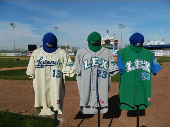
The Lexington Legends (Low Class A; Sally League) adopted new bold uniforms and a branding scheme based on the mustache sported by Big L, arguably the first bro on the planet. Yes, mustaches are trendy now, and the Legends were smart to jump on the trend. We’re especially enamored of the LEX letter on the road jerseys.
 And, finally, the ownership of the Sioux Falls Canaries (independent; American Association) came to their senses and dropped the Pheasants name — which, after all, belongs to Aberdeen! — in favor of the Canaries, bringing back the old logo and adopting new alternate marks, like the one shown to the right. Really, there was no reason to drop a historic name like the Canaries in the first place, and bringing back something with plenty of name recognition made lots of sense. It paid off at the gate, as well: Canaries attendance was up significantly this season.
RELATED STORIES: 2013 Promotions of the Year: Lehigh Valley IronPigs
—-
Share your news with the baseball community. Send it to us at editors@augustpublications.com.
Are you a subscriber to the weekly Ballpark Digest newsletter? You can sign up for a free subscription at the Newsletter Signup Page.
Join Ballpark Digest on Facebook and on Twitter!
Follow Ballpark Digest on Google + and add us to your circles!
