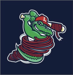
We have the new logos and branding from the Lowell Spinners (Short Season A; NY-Penn League), as the transformation of the franchise continues.
 The new logo, introduced today by owner Dave Heller, sets forth a new look for the team. First, Lowell — as opposed to Spinners — is emphasized in the new branding. Second, the team’s Canaligator (shown at right as the cap logo) becomes a prime part of the branding: good for kids, good for a mascot, good for a face of the franchise. Third, the city’s mills and factories are now part of the logo and branding; spinners, after all, is a reference to the city’s rich history of mills and branding. And, finally, the team colors and lettering (as shown in the wordmark below) are more tied directly to parent Boston Red Sox.
“Our new logos better reflect exactly who we are,” Heller said in unveiling the look today. “The old logos did not even mention the word ‘Lowell.’ We are proud not merely to be from Lowell but of Lowell; the canals that run through this great city are a big part of our DNA, and we are proud to put the Lowell name back on our logo, jerseys and caps. We also wanted to incorporate our affiliation with the Red Sox as well as the factories and mills that define Lowell. Like the Spinners, they are an integral part of Lowell’s past, present and very bright future.”
These won’t be the only changes fans can expect in 2017: the team has announced ballpark upgrades and the addition 0f family-friendly amusements this season.


